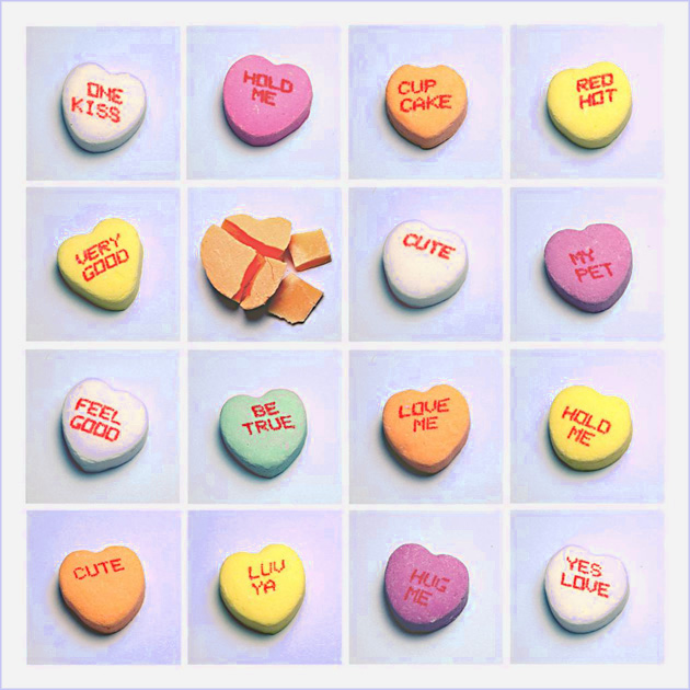
Set up the camera and light and took a ton of shots of individual conversation hearts so that the lighting/shadows would be the same for each. Smashed one with a hammer and took a picture of that one too. Cropped all 20 with the same fixed size into a new picture. Rearranged them on the grid and aligned them (as close as I could by hand). Played a ton with the brightness/saturation/sharpness/coloring (and learned a lot of new tools in the process, although I can't say I remember how to use all of them). Went through about 15 different versions. As I was deciding on which to submit, I played with the 'Replace Color' tool one more time, and somehow ended up with the neat background. Yep. Still learning and I still have a long way to go. Resized, added border and submitted with an hour to spare!
Statistics
Place: 24 out of 140 Avg (all users): 6.1569 Avg (commenters): 7.9412 Avg (participants): 6.1268 Avg (non-participants): 6.1729 Views since voting: 2678 Views during voting: 374 Votes: 204 Comments: 23 Favorites: 1 (view)
Cute! I like the mosaic idea a lot... The broken one is well positioned but why can't we see any broken up letters? The surface seems to be missing! There seem to be some strange artifacts along many of the edges of the hearts - perhaps from compression or one of the processing steps. Cute image though!
This is a very out of the box idea. Truly excellent. Great comp(s), excellent color, love the lighting, great texture, b&w great, excellent flow, like the broken heart, great touch, overall please have a print available.
You have really thought about this and excuted it so very well..... I like it a lot and I am sure this will be in the top ten....."WOW" factor from me, well done.....







 Add photograph to your favorites
 Add photographer to your favorites

 Photographer found comment helpful.


