I think this was much better than the 4.5 score it received.
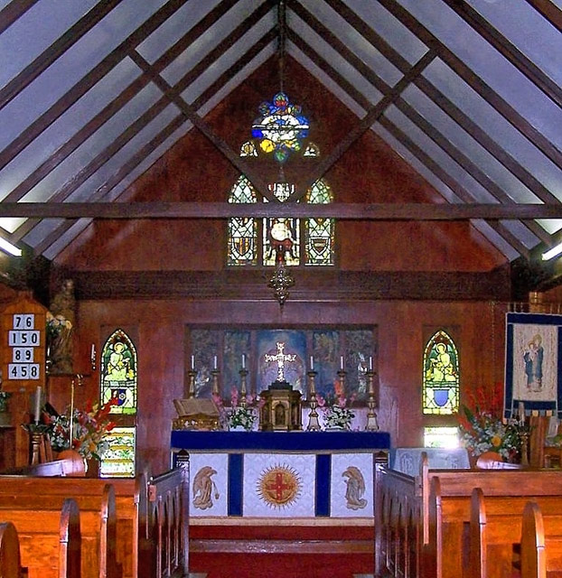
I tend to disagree with the suggestions of shooting at an angle. Although you may try again with their suggestions, I think it would lose it's symmetry. I love the way the pulpit(?) is arranged and the candles behind it.
The light coming in on the left and right sides (where the roof meets the walls) may have been avoided with either a bit more zoom or a slightly tighter crop.
I see you got some comments about grain. There's a couple of products (Neat Image and another one I can't remember right now) that have been mentioned in the forums. If you haven't already, download them and give them a try. (They're free.)
Do you know the significance of the numbers on the left? Just curious. :)
The flash hot spots and overall grain detract from your image for me. Perhaps if taken from a different angle and not so..."dead" centered would enhance your concept.







 Add photograph to your favorites
 Add photographer to your favorites

 Photographer found comment helpful.


