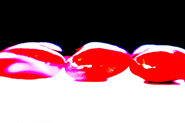
Sitting in my car, I took a pic of 3 heart candies in macro. For giggles, I blew everything out. Overexposed, white balance thrown off the charts, sat at 100%, clone, crop, and sharpen. I just liked the simple idea of basic design principles for this one: line, shape, color, pattern, etc.
Statistics
Place: 137 out of 140 Avg (all users): 4.0619 Avg (commenters): 4.8000 Avg (participants): 3.9867 Avg (non-participants): 4.1037 Views since voting: 800 Views during voting: 293 Votes: 210 Comments: 6 Favorites: 0
Your image reminds me of a pop-art, Warhol-like illustration. That's not necessarily a bad thing, I'm just not sure I like it personally. I think it's the overly bright white areas on the red objects that detracts for me.
I can just about make out that they are hearts, but that's only because I know it's a heart challenge.
I don't think the abstract type colors really do anything positive for this picture.
sorry.






 Add photograph to your favorites
 Add photographer to your favorites


 Photographer found comment helpful.

