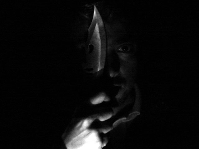
Critique by arnit I like the black negative space. In my opinion the lighting could have been better. The burned out hand bother me a bit because that is the first thing that I see and my eyes keep on moving to that spot. I would like to see a bit more light on his face and on the blade. Maby the whole right side of him lit. Good luck in future challanges.
An interesting photo, definitely appropriate for the theme. I would have liked to see the light perhaps highlighting the knife more than the hand though as the focus tends to be drawn to the washed out bit of the hand, which.





 Add photograph to your favorites
 Add photographer to your favorites


