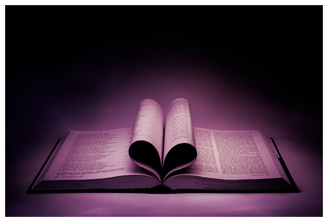
I had taken this image the first time back in December for my girlfriend, along with many other similar images, most of which would have fitted this challenge.
I used what experience I gained during the first shooting for taking the photograph again today.
Since there are no PP rules, I tried High Pass Sharpening. The results are more or less the same, but HighPass was better at keeping the lightness values.
Statistics
Place: 13 out of 140 Avg (all users): 6.4865 Avg (commenters): 7.5500 Avg (participants): 6.3158 Avg (non-participants): 6.5753 Views since voting: 2506 Views during voting: 403 Votes: 222 Comments: 30 Favorites: 4 (view)
Critique by arnit I like this picture. The color of it is just perfect. It is so smooth and the shadow inside the heart is just spot on. The light that shines on the pages at the bottom of the heart is just perfect. The burning really frames the subject that is the heart. My eyes go straight to the heart and that is good. That is what a picture is suppoast to do. Lead you to the main subject. The only thing I see that could have been done better in my opinion is to find pages that had text all over it. The page on the left has fewer letter than the one on the right.
Seen this technique before - and i still like it. Like the colours and the exposure is perfect. There are some highlight lines on the background which I find a little distracting. All in all, a cracking shot.
I like how you turned the pages in to form a heart - shows creativity. For me, I wish there was another element such as a rose or...something for additional interest.
This is a lovely idea and well executed too. I really like your purple toning and the strong vignette too. The strong light and shadows work well - I particularly like how deep the shadow inside the folded pages are - it makes the heart shape really stand out. It's a shame that the page forming the left side of the heart doesn't seem to have the same densely packed text on it as the other tree pages shown - perhaps it's a chapter heading or something? But it's not a big deal. I am curious about what the book is...
good colors and lighting
neat idea
only quibble would be trying to get the centre of the heart to stand up a little higher so it didn't look "collapsed"






 Add photograph to your favorites
 Add photographer to your favorites

 Photographer found comment helpful.


