First, regarding score and placement, I think the issue voters have here is deciding how this relates to the theme. The connection appears to be to obscure for the amount of time the "judges" spend voting. I can't honestly say I see it either, and I've been looking at it longer.
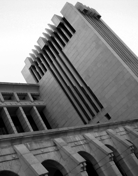
As for the image itself, composition is interesting with nice lines. The subject works well here.
Technical factors which can be improved: the sky appears overexposed, and some posterization is evident in the upper left, which may mean that some of the blow out is from adjusting levels and/or colors in processing. The building itself may have been in shadow, and the loss of sky may have been a consequence of adjustments. The buiding has nice tones, but perhaps could have more contrast.
If you are shooting to please yourself, you are most likely on track. If you are going for scores, you should think of your photo as means of communicating, and the message must clearly speak the challenge topic.
Summary Overall: Nice shot, good composition but weak on topic, with some technical issues that can be handled by more controlled exposure and processing.
I like the angle of your photo. If it were a bit...brighter or more contrast, I would have scored this even higher. Good composition, in my novice opinion.
nice use of leading lines. i dont think the black & white helps though, there are way too many mid-tones of gray, and the sky seems to just wash out. perhaps if this was an advanced challenge, you cuold have darkened the sky a bit mroe to make it seem more ominious





 Add photograph to your favorites
 Add photographer to your favorites


