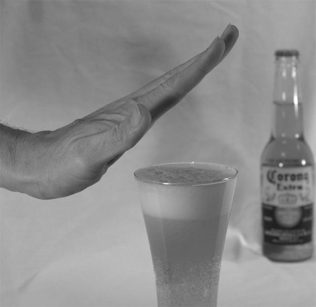
the white backdrop in this image is all wrinkled and REALLY pulls away from the image
also lighting on the bottom of the hand and middle finger is too dark. the beer bottle is too close to the right side of the frame, and you've really lost the warmth of the image by converting to black and white. i think the golden hue of the beer would have contrasted nicely with the flesh tones of the hand, but you're removed that altogether. :(
A good idea, which could be improved technically. The wrappings of the background are distracting a bit, I would iron it and would not place the bottle to the side, I would put it a little bit more to the left, no matter if the glass covers a part of it. Holding the hand absolutely vertical would make your decision more confident, IMO.





 Add photograph to your favorites
 Add photographer to your favorites


