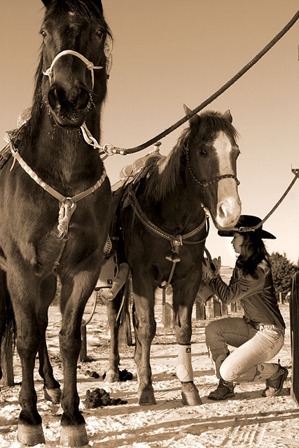
Resized, rotated, sharpened, hue and saturation to get the sepia tone, brightness and contrast, levels, curves, dodging and burning...I think that is everything...
Statistics
Place: 11 out of 219 Avg (all users): 6.4793 Avg (commenters): 8.1538 Avg (participants): 6.5248 Avg (non-participants): 6.4397 Views since voting: 1948 Views during voting: 326 Votes: 217 Comments: 24 Favorites: 3 (view)
This image did very well for you to get to the top 20! The sepia tones and your choice of subject was great. I also like the low angle of view looking up to the horses. I also like the diagonal formed by the reins. The only suggestion for improvement that I have is that the far left horse has the top of his head and ears cut off in your framing. I think including them and perhaps a little more of his body on the left would have brought that horse's face more into a power thirds position creating a slightly stronger composition.
This image did very well for you to get to the top 20! The sepia tones and your choice of subject was great. I also like the low angle of view looking up to the horses. I also like the diagonal formed by the reins. The only suggestion for improvement that I have is that the far left horse has the top of his head and ears cut off in your framing. I think including them and perhaps a little more of his body on the left would have brought that horse's face more into a power thirds position creating a slightly stronger composition.
Angela: very proud to find you here in the top 20. This challenge has quite a collection of fine images and I am glad that your is one of them. Congratulations on your top 20 finish.
Nice scene and beautiful horses. I like the low angle because it puts you in line with the cowgirl while showing the size of the horses in a dramatic way.





 Add photograph to your favorites
 Add photographer to your favorites

 Photographer found comment helpful.


