Author Thread Comments Made During the Challenge
Post actions
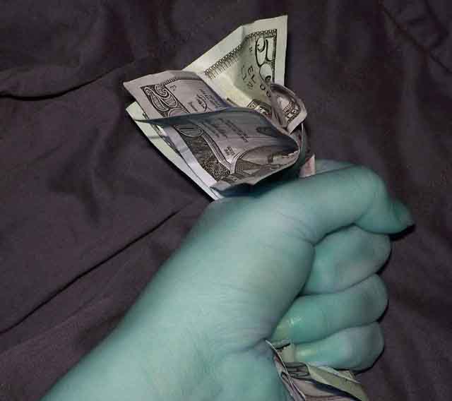
I don't like the colours. I would have put the dark cloth further away, to blurr it and increased the depth of field to get the hand sharp.
Post actions
what is with the green hand?
Post actions
Strange Colours. I think it would have looked better in B&W.
Post actions
Post actions
the coloration throws me off...wish the background were more out of focus (further away) and the lighting weren't so harsh (assuming flash was used)
Post actions
6 Nice play with colours. Too bad it looks pixelated.
Post actions
JPG damage.. Looks like a screenshot from off a webcam.. Still, nice concept..
Post actions
Good concept..hand coloring is really uneven,skin tones should not vary like that even greedy skin
Post actions
This is realy pixelated.....you'll have to work on saving at a better file size.
Post actions
the color of the hand is pushing to far, that firm grasp was enough. The other thing is the background on this shot is too dominanat. Try not having the subject to close to the background and it will fade out
Post actions
Post actions
There is something about the skin tone that bothers me, too green, and I would have liked the hand to be in focus.
Post actions
The negative image is captivating and certainly gets your attention but it just doesn't look right to me







 Add photograph to your favorites
 Add photographer to your favorites


 Photographer found comment helpful.


