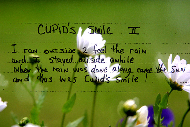
Was this written on a window or done in Photoshop? I feel this only peripherally meets the challenge, as it really doesn't focus on the effect of a transparent object on light.
interesting! i had to look at this for a while to figure out what you had done. i think it's simply writing on a sheet of glass, there are some reflections of the flower visible. why the lines? that's the part i don't get. also, keep an eye out for things that just protrude into your frame, they can become a little distracting. there's a white flower poking in from the right, and the tip of a leaf at the bottom, just left of the middle. try and eliminate those. -- gr8photos (5)
I love the colors. It has a really nice summery feel to it. I'm kind of undecided about the horizontal lines though...my first thought would be to either get rid of them entirely or continue them, but I guess I'd have to see it both ways to be sure about that.
Well, as I look at this again, I just love it. It's a beautiful idea. Can you let us know how you did it? The flowers are so vibrant in the background and what a sweet poem. Did you write it? This creativity deserves a 10!!
Very cute! Nice job of composition and positioning your subject. The flowers are slightly overexposed and it tends to fight the softness of the mood just a tad. Nonetheless, I like this photo very much and think it is quite good.
Did you write on a window or is this a transparency page? Very artistically done. Could have been a Valentine's Day card. Suggestion: Use a piece of wide lined paper taped to the window, write your text, then remove the paper, if transparency paper, it's even easier. I don't like the lines. Photo 9 Transparency 8 total 9 swash
I have thought about this photo for a while now and the only thing transparent about it is the transparency used to insert the text into the image. It *is* transparent, but to me, the image does not show or convey transparency to me. = 4 - jmsetzler
This is very original. I really like the colours and dof. The composition is slightly off... one minor improvement would have been to crop out the small white leaf in the lower left corner thereby allowing more of the flower on the far right to be captured. This would have also shifted the two centre flowers more towards the left.
I really like this. The blue is distracting though. Need either more or less of it. There are also a couple of reflections (left bottom and right center) that detract. Nice work though.





 See how this photograph was created!
 Add photograph to your favorites
 Add photographer to your favorites


