Collection:Flowers Camera:Kodak DX6490 Location: Little Mt. Home Park Garden - Caloundra Date: Feb 2, 2006 Galleries:Nature, Floral Date Uploaded: Feb 7, 2006
When I first got into photographt, I did a lot of flower shots. I have since migrated more toward studio portraits but looking at your flower shots has inspired me to go back to my first love.
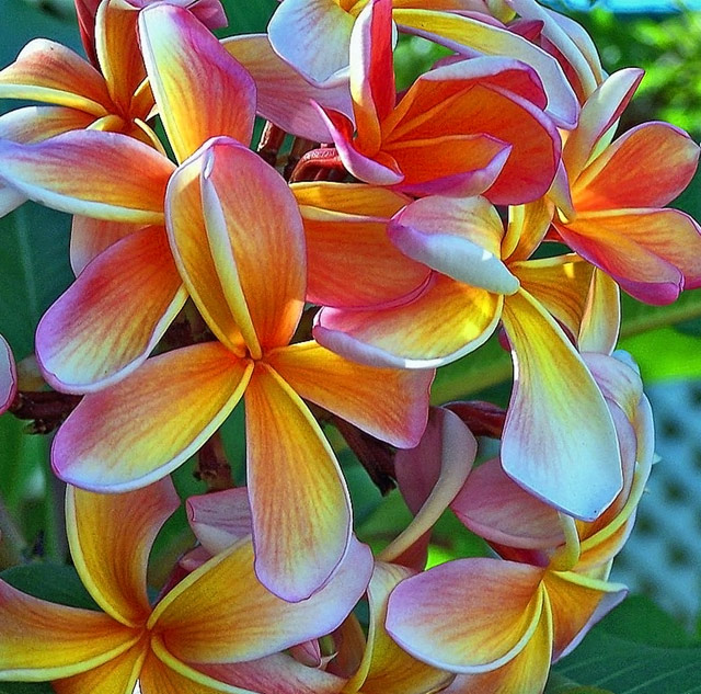
Aussie gardens can be wonderful. The floral photos you have confirm. Frangipani, I believe, or Plumeria - used as a Lei flower in Hawaii. I think we used to have this in our garden in WA.
its amazing how you capture the beauty of the frangapanis. It really is a beautiful photo, something i wish i could do! It almost looks like a painting. You are very talented.
Thank so much for your comment..... "DPC" is such a great site, and I love every minute that I am on it, learning each and every day more and more about digital photography.....
Originally posted by Sinky:
Shez, this is a great photo. The colours, form, composition....all make a very successful image. Well done. I look forward to keeping an eye on lots of your work, as I also begin discovering all that DPC has to teach us.
Shez, this is a great photo. The colours, form, composition....all make a very successful image. Well done. I look forward to keeping an eye on lots of your work, as I also begin discovering all that DPC has to teach us.
I can't believe I have had 14 comments on this one already, and "THANKS" everyone who has looked and passed comments on my new images. You make me feel so good.
Originally posted by naomik:
Crystal clear with beautiful vivid colours. You've really captured the beauty of the flowers!
Yes, it is the same type just a differant color. The one that I have photographed is one of the most beautiful colors you can ever see, just like whats in my image. They now are available in all types of colors and they smell really good. The origional, most sort our "Frangapani" or "Plumeria" is white with a yellow centre. They are one of my favorite flowers to.
Originally posted by Xilebo:
Sheryll, isn't this the Plumeria??? My husband's favorite flower. He has brought half a dozen of these from Bangkok and we've had luck with only 1 tree sofar with white blooms absolutely beautiful fragrance!
Your photo absolutely wonderful and I'm so glad finally be able to see your portfolio, congratulations.
Sheryll, isn't this the Plumeria??? My husband's favorite flower. He has brought half a dozen of these from Bangkok and we've had luck with only 1 tree sofar with white blooms absolutely beautiful fragrance!
Your photo absolutely wonderful and I'm so glad finally be able to see your portfolio, congratulations.
Beautiful colors. Such a great subject! I like how you've used the whole bunch in the comp, it has a kind of 'whimsical' air about it. I do think I agree with some of the previous comments. I can see moving a little to the left and more angled could be quite nice. It could eliminate the fence, and bring a little bit of dof into play. Maybe composing so the prominent foremost flower is more in the lower left corner, close to a thirds line could make the image 'pop' more. I also see the 'grain' mk is talking about. Did you process the photo much? It could be a high ISO setting. I have the Kodak DX7590, very much like your 6490 I believe. I think the main difference is the zoom and 4 vs. 5 mp? Anyways, I usually have pretty good luck staying at 80 ISO, unless I'm fighting poor light. Even then, I try longer shutter speeds. Anyways, nice shot though, it is quite vibrant and a very appealing subject. Oh, and the blue shirt looks great on you :-)
Visually appealing. I'd try to put the flower in the left center more in the left bottom. maybe a litlle less sharpness would improve a bit. Unlike MK, i'd suggest moving to the left to be more diagonal with your subject and close in as much as you can to lessen DOF. It could become a great piece of photography.
Being "NEW" to the technical side of photography, I am still not sure about some of your comments, but so eger to learn.
I am trying to finish voting on the "Free Study" before roll-over, so can I get back to you please, to find out if you can advise me about your comments.....
[quote=mk] Beautiful flowers. I'm not sure what the whole bouquet looks like but it seems like perhaps moving a bit to the right would help a bit...the bouquet seems to taper off at the right but not on the left. The white fence and bright spot at the top right are a bit distracting - the part at the top may be helped just by desaturating it a bit. I'm curious about the grain - has this been sharpened quite a bit or are you shooting at a high ISO? [quote=mk]
Beautiful flowers. I'm not sure what the whole bouquet looks like but it seems like perhaps moving a bit to the right would help a bit...the bouquet seems to taper off at the right but not on the left. The white fence and bright spot at the top right are a bit distracting - the part at the top may be helped just by desaturating it a bit. I'm curious about the grain - has this been sharpened quite a bit or are you shooting at a high ISO?
Thanks so much, this is exactly what I needed, as this is how I am going to learn from the best that DPC has to offer.....You all make my heart sing.....
Yellows and reds are a couple of the hardest colours to get right. A lot depends on the lighting. There's some nice soft light falling on these rendering the colour very well. None of the areas seem over exposed.
Compositionally I think the image may be a bit cluttered however if you play with different angles, from below, from a different side, you may come up with something that works with the clutter. The flower in the lower right may be one to try a lower angle on.





 Add photograph to your favorites
 Add photographer to your favorites

 Photographer found comment helpful.


