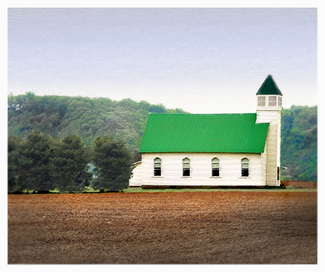
Sorry this did not do better. The greens are so saturated on this one. The various green tones really make this photo. I guess the clarity is what brought it down. Hope to see more of your entries. Anyway, mine fared really badly. 184th. Guess when I don't pass my images past somebody beforehand, I get bad scores.
Nicely captured, but it appears as though you did some processing to it which I find distracting. The line around the edge where the blurring begins keeps catching my attention and drawing it away from the church. While I like the soft feel you were going for overall, I think I may have preferred less editing.
A classic image, I love the lines and colors, but I don't get the processing (blurred on the sides, especially the right, seems to have a vertical line that doesn't seem natural).
There was some editing done here im not sure im fond of. I like the foreground colors. Something strange happened on the right side trees behind the church.






 Add photograph to your favorites
 Add photographer to your favorites

 Photographer found comment helpful.


