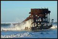
Drove out to the shipwreck of the Peter Iredale near Astoria, OR. The ship was grounded in 1906. This is all that is left 100 years later.
Shot near sunrise with a 2-stop ND filter and 2-stop polarizer. I have a number of outtakes to share after the challenge.
Post production involves pretty well all adjustment layers allowed. It was also converted from RAW.
WOW!!! It's my first blue given DURING the week the challenge is over. ;) What a great location. Here are some outtakes for you to enjoy...
Some people have commented on the haloing. It was not intentional. It is not as apparent at 1900x1200, but I saw it at 1024x768 at it was quite a bit too much. The print is redone with advanced editing and does not have the halo effect.
Statistics
Place: 1 out of 285 Avg (all users): 7.2837 Avg (commenters): 8.2973 Avg (participants): 7.0962 Avg (non-participants): 7.3933 Views since voting: 19412 Views during voting: 477 Votes: 282 Comments: 94 Favorites: 35 (view)
Hey Jason, congrats on the Blue! And hello from Lima, Peru! I´m even checking DPC while on vacation. Awesome picture, perfect for the challenge! I can´t wait to see it on a really monitor (this 14 inch one with 640x480 resolution is a trip).
::: Critique Club ::: Since I've been asked here, to put my money where my mouth is I'll use my CC template if nobody minds.
First Impression - the most important one: As soon as you look at this photo, it strikes you as having a difference to all the others. It's a combination of the subconcious reaction to the composition and the unusual shape and texture of the subject and it's also the light values. I suppose it's the ethereal feel and that it somehows tugs just a little at your emotions.
Composition: There are composition "Rules" which of course are not rules at all but are a set of reseached and known illustration structures that have been proven to appeal to viewers. This applies to paintings as well as photographs. As 'creative' as we all want to be, these rules appear to have worked for a couple of hundred years and I think we ignore them at our peril.
The main 'rules' are all applied to this image in one form or another.
- Rule of Thirds (A): Elements should fall on a thirds line at least and at best on a thirds intersection. In this image, where the ship emerges from the water is on the horizontal thirds line and the bulk of the ship, particularly the vertical stringer of the highest point of the ship, sits right on the right-hand vertical thirds line.
- Viewing Flow (B):Again research has proven that the eye enters an image at the bottom-left corner and transitions to the top-right corner. As you can see with this image there is space and room for the eye to enter and follow the wreck's structure to the top-right thirds intersection. This can be and is combined with the Leading Lines Rule.
- Leading Lines(B): Leading lines are elements or structures of an image that lead the eye to the Point of Interest (POI). Not only does this image have a Leading Line from the nearly submerged bits of the wreck to the height of the structure but the leading line is from bottom-left to top-right and they lead to the POI that is perfectly on a thirds intersection.
- Stop Point (C): Another element that can help a composition is in conjuction with Viewing Flow. If you have an element that stops the eye leaving the image out of the top-right corner, then you've added another satisfaction point for the viewer and another reason for them to feel comfortable with and like the image. This is often achieved with a tree framing top and right or a building etc. In this case the size and imposing nature of the wreck superstructure effectively stops the eye from moving on.
The viewer/voter doesn't analyse any of this. The response to the image is totally subjective, that's why these rules work on the subjective, not the rational plane. Here's the graphic of the application of all of these in this pic.
So you can poopoo this whole concept if you feel uncomfortable being constrained by 'rules', certainly may people in DPC do. Certainly any such rules are "... for the adherence of fools and the guidance of wise men ..".
Do these rules by themselves make a great image? I doubt it very much. Can a great image be created without being mindful of these rules. I doubt it very much. Of course there are always exceptions, many amazing images do not conform to the rules but most do.
Subject: We can't underestimate the value of the emotive impact of the subject. That's why models are all 20 something and size 8 or 10. The subject here is beautifully evocative. We initially don't know what it is so we have to examine the picture to work it out. Once we work it out I image the reaction of most of us is "... how cool, I wish I had something like that to shoot...". No doubt we'd all like to be there to explore it too - we're hooked. This personal involvement with the subject has to count for heaps in voting. We all look at images that just don't involve us at all, the actual difference in subject is subtle but is powerful in our voting. On the subconcious level, there is also a contrast here between the hard iron and the soft water.
Technical (Colour, focus, and light): Technically, the over-sharpening halo is bad bad bad but there's enough good stuff about it that it hasn't really mattered to the voters. Now we've got that out of the way, onto the good stuff. Look at the difference between the very ordinary outtakes (that would score around 5.5+ range) and the winning image. They're like chalk and cheese, so what makes that difference?
- The soft water: is an inspired element. So many of the voters mentioned it that it clearly mattered a great deal. The long 2 second exposure may have simply been because the light was failing and DrAchoo needed to keep shooting as he wasn't happy with it yet. The result of the soft water and the subject matter just introduced that ethereal ghostly haunted look that makes this stand out.
- The Light: Look at the outtakes, they were all taken earlier. Their light was low and interesting and showed up more of the structure of the wreck. Then look at the final and realise that in this case it's better not seeing all the rust and detail. Why? I've no idea really, it just seems to fit the mood of whats created.
- The Sky: Isn't it great. As we all know, it's not possible to plan for skies like this, it just happen. We simply have to have 'the eye' and be aware of the possibilities. From the camera settings, when this was taken it was almost dark so it falls to the photographers experience and faith to keep shooting.
To grow its vote?: I doubt it lost any points for the over-sharpening but that's just about all you could find 'wrong' with it.
Summary: I'm glad the question was raised because like all critiques, it has made me examine the principles in depth again and remind myself that control and discipline has to be ther on every shot.
What a great shot, fabulous photo and well deseving blue.
Well done !!!
*edit*I will also say the B @ W and the splashs are fabulous. You cant get any better then first, but they also splendid photos. Must have been a tough decision.
Great Shot! I really enjoyed looking through your out takes! it's a great idea to post them, to offer us all a different prespective on what your seeing! Thanks so much, and verry deserving! Nice shot, and good luck in the future!
That is a great picture. I am so glad that you won. I went to college in Oregon and now live in Florida and as soon as saw that picture reminded of great the Oregon coast is. For me you captured a lot of memories of great times in one shot. I also like your BW outtakes. Very cool!!
Congrats on a well deserved Blue. Haloing is normally viewed as a defect or flaw, but here it seems to add a certain something to the shot and is not at all objectionable. Well done.
the motion in the clouds and water and the hard, rusted jaggedness of the objects illustrate the title well, best example in the challenge, I think...and while the clouds seem to leave the frame, the waves bring your eyes back in to the objects in the water which reach up into the open sky...good job!
love the flow of the water, the detail of the broken ship, and the composition. There is a bit of haloing - might want to reprosses this with a bit less USM
Fantastic, Great composition IMO. Love the look of the water. On my screen it's a bit too bright, I think a darker tone would have helped transfer the feeling of degeneration and aging better. Bump anyways.
Very nice....back for another comment. Even though I can see 6 or 7 specks of dust this is still my favourite and highest rated photo of the challenge. Good luck! (you probably don't need it)
Nice use of a long exposure to create quite an ethereal effect in the water. And well planned/ timed to catch the light so that there is detail and colour in the main subject and also in the clouds and sky. Great composition too.
good capture--looks surreal like a S. Dali image and i like the water motion. The lighting on the objects seems a lttle weak/flat due to clouds blocking sun? anyway very good capture -9







 The Corrosive Touch of Time
 Add photograph to your favorites
 Add photographer to your favorites


 Photographer found comment helpful.


