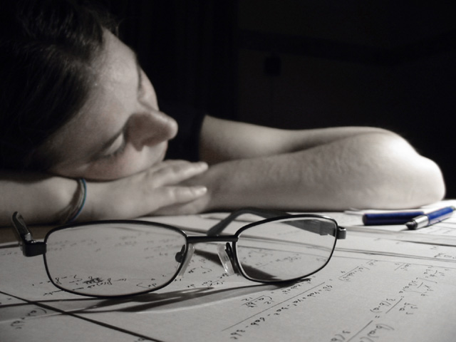
Challenge:Transparency (Classic Editing) Camera:Canon PowerShot A20 Location: the room of her sister :) Date: Jun 27, 2002 Aperture: 3.0625 ISO: 100 Shutter: 0.201311 s Date Uploaded: Jun 30, 2002
To get the "blue pen", I augmented contrast and luminosity, and then desaturated red, yellow and green with the "Image--Adjust--Hue/Saturation" option in Photoshop. I agree that the challenge topic is not really well empasized here, but I'm happy with the result. Thanks for all your votes and comments.
sorry, i ran out of time to comment. i was going to say that i really like the blue pens against the b&w of the rest of the photo. how did you do that?
I have been here before :) great shot.. I think the only thing that is keeping me from giving this photo a 10 is the lighting. The amount of light is perfect but I think a little more contrast may be in order possibly. I would love to see the skin tones contrasting a little more with the paper, but that's probably impossible... good shot! = 9 - jmsetzler
It is technically pleasing and it meets the challenge, but only peripherally. The main subject (for me) is the sleepy student, not the magnified formulae seen through the specs. 5 sjgleah
I really like this image. Funny how it looks desaturated until you notice the blue pen. To me the emphasis is more on the girl in the background and not the transparency so it looses a point there. Great job!
ewww, math....well depicted shot. O.K. I just realized the pen is blue, how did you get the rest to look sooo black and white? Photo 7 Transparency 6 total 7 swash
The pen is a perfect touch - would have been nice to have it in focus but then you would have had to compose it somewhat differently. The subject of the challenge is however not very powerful here...





 Add photograph to your favorites
 Add photographer to your favorites


