OK - I voted this a 5!
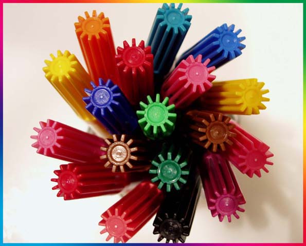
For me the reasons it didn't get higher are, a) its a little bit of a tired theme, there are lots and lots of examples of this on DPC, which is not a problem except that many of the examples are much more vibrant and cleaner than this. b) the colors are dull and washed out, nothing really jumps off the screen. If you are going to repeat a formula then you have to take it one step further. Its fine to learn and practice, but your scores will reflect that. c) the border doesn't do much for me, but again thats personal taste.
All that being negative comment I do think you have had a reasonable attempt, with better lighting you might get a sharper and cleaner image. Boost the saturation in PS and you will be well on the way.
Hope you don't think I'm being too brutal |





 Add photograph to your favorites
 Add photographer to your favorites


 Photographer found comment helpful.


