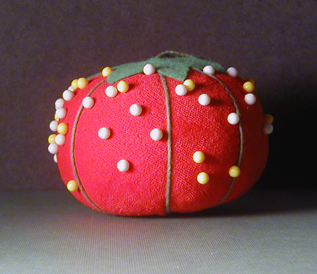
Good concept. Focused well. These pen heads are very difficult - I tried them once and gave up. I think a consistent background and floor is better in this situation - or put the background way, way back so that it is not in focus and not lighted. The reds seem off also - might want to check the color balance. Hope I have not offended you with the suggestions.
My Mom has a pin cushon just like that........2 points just for nostalgia. It's sharp, colorful, well lit and the deadcenter composition even works well here.
cute! the overexposure steals texture away, but the resulting contrast shadows give attention to the pin ends. interesting dillemma. The shadow on the right is too dark for my taste. it's a visual void. makes the picture look off centered when it actually isn't. 4
the lighting washes out the colors. I think adding some constrast to darken the background would have allowed the pincushin to stand out more. perhaps having some pins sticking halfway out would add more interest also. :o)





 Add photograph to your favorites
 Add photographer to your favorites


 Photographer found comment helpful.


