Author Thread Comments Made During the Challenge
Post actions
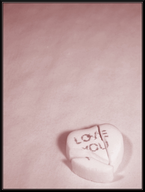
I whole heartedly agree with your title. I like the composition and color treatment, but for me, had it been a bit more in focus, I would have scored it even higher.
Post actions
...and no one said you couldn't benefit from cavities. ^^
Post actions
Very pretty, I think the colors really work for this image.
Post actions
great portrayal of the "broken heart" concept...
Post actions
oh i remember these, they tasted something weired. i kind of like this but they ould be some more color
Post actions
Would like to have seen the loveheart sweet a little sharper focus
Post actions
Like the minimalism and the gradation in the background. Photo benefitted from the border...good choice. 6
Post actions
Simple, minimal and one cannot possibly miss the message. Is the pink colour cast deliberate? I'm not keen on it. Otherwise, like the image overall.
Post actions
I like this one a lot... it looks like it would make a great stock image! wish there were less distracting shadows around the candy, though.
Post actions
Post actions
Would have liked a different color background to have the candy stand out more.
Post actions
Post actions
Great idea....just wish the background were a different color. I agree with the sentiment here.






 Add photograph to your favorites
 Add photographer to your favorites


 Photographer found comment helpful.


