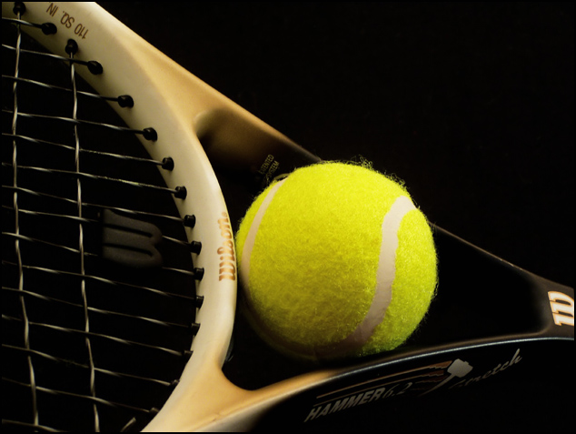
Shot with one 500W and one 60W bulb. I illuminated the background a bit mostly to get rid of as many reflections as I could. I wish I could have gotten rid of the Wilson logo, but it wasn't coming off no matter what I tried.
Post - added some black (selective color) and cropped and resized. I took enough that it was more "pick one" than "edit the one you took." I had all sorts of variations.
Prediction - 6.1
Statistics
Place: 48 out of 293 Avg (all users): 5.7364 Avg (commenters): 6.3750 Avg (participants): 5.8015 Avg (non-participants): 5.6310 Views since voting: 1121 Votes: 220 Comments: 14 Favorites: 1 (view)
Thanks Jason - I am not sure about submitting anymore. This shot is 10 times better than my other tennis shot. The lighting is exactly what I wanted. I knew the effect I wanted to achieve (three leading lines leading into the ball) and I practically copied this idea from a pro photographer. The other balls are hot and these aren't as bad. The lighting here isn't direct, etc. I learned a lot from the last shot and this one is, IMHO, ten times better. I don't know why it didn't do anything for some people, but ... it sure did for me.
hey mav. good to see you're still submitting. This shot was nice, but not nearly as good as your other tennis ball shot. Anyway, nice work overall. Seems we're submitting to opposite challenges recently. I didn't submit or vote for round, if I had I would have given you a 6.
Well there's nothing wrong with this shot that i can see: all the technical elements are there, the composition is pretty good (though perhaps the ball is a little too central), lighting and detail are all fine.
Something's missing though, but I'm not really sure what - perhaps simply waht a lot of people refer to as the 'wow' factor. Were it my idea, I think I'd have tried shooting froma lower angle to the plane of the racket: I think you'd still keep the roundness of the frame, but the roundness of the ball would break out of that plane a bit more obviously, would give more of a three-dimensional impact which this lacks a little. I also think you've perhaps wiped out too much shadow - if you see what I mean it's too well lit: that lower angle might have given a bit of reflection from the fibres of the ball and maybe the frame and have emphasised the highlights a little more. Just my thoughts though.
I think I'd also have cropped out the 'w' at the top of the racket handle - I find it a touch distracting so far to the edge of the image.
Good competent shooting though - just not quite inspired enough really.
I love the leading lines going towards the main subject... the round ball. The ball looks maybe a tad bit hot, but it's not too bothersome. I like the negative space at the upper right corner... nice how there is more space there and less on the bottom... gives it a not so centered look. A nice image... well lit... good job
go tennis! i was staring at the tennis ball by my computer thoughtout this challenge. hehe. not too big on the black background, but nice subtle lighting.
Nice. Lots of roundness going on here. My only nitpick is that the ball is a little hot, and tends to dominate more than it should. Perhaps a black and white or duotoned image would knock back the tones and make it more balanced. Just a thought.





 Add photograph to your favorites
 Add photographer to your favorites


 Photographer found comment helpful.


