Author Thread Comments Made During the Challenge
Post actions
Post actions
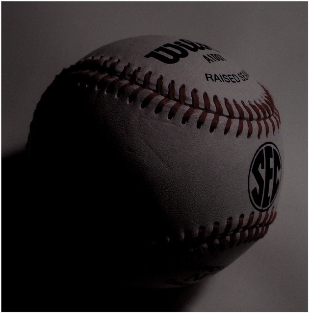
Too dark..I feel like I want to turn the lights on a bit more. I feel eye strain...
Post actions
Interestingly artistic lighting choice...
Post actions
Post actions
this shot is pretty dull, it needs more contrast. the white ball, the white background, make the red stitching pop. i think the lighting could be improved as well
Post actions
Nice textures, but on the dim side.
Post actions
good shot... a litte dark though
Post actions
Good shot, nice use of shadow, a bit more light may have picked out the red of the lace a bit more, nice positioning of the text on the ball.
Post actions
Rick! This is a good shot...what happened to the light? Just kidding man....
Post actions
A bit lighter, I would have given it a brighter score.
Post actions
very dark... probably adjusting the contarct would have helped.
Post actions
It appears to be quite dark on my monitor.
Post actions
Perhaps if the photo had been lighter it would have been a little better.
Post actions
Post actions
Far too dark an image, why is it so dark? Obviously an inside shot, if you have a camera where you can adjust the exposure value and shutter speed try it next time
Post actions
good idea, but the lighting could be bette, a little bit too dark for my taste
Post actions
overly dark. if the ball has some shade of white on it, it would make a great advertisement for Wilson! pls also allow me to say that the border doesn't compliment the photo much, hardly visible. you could have broaden it or use another type of border.
Post actions
any reason why it's dark?
Post actions
This is very dark. It's good texture & detail though. [4]
Post actions






 Add photograph to your favorites
 Add photographer to your favorites


 Photographer found comment helpful.


