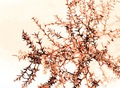
This took some detailed processing. I use Photo shop elements first. I used the magic wand to select all white areas then changed thru menu to select inverse. Changed the hue to -12, saturation to +10, brightness to -6 and contrast to +15. Then used Dust & scratches tool under noise and adjusted with radius = 15 and threshold = 3. Image was then cropped.
I opened the picture in Microsoft digital image pro and using the usm feature, adjusted the amt of contrast 500%, edge width to 1.0 and noise reduction threshold to 3.
At this point, I had it almost where I wanted, Ran it through Neat Image and then opened 1 last time in PSE to resize, sharpen and save for web.
Statistics
Place: 207 out of 325 Avg (all users): 5.1534 Avg (commenters): 6.6667 Avg (participants): 5.0273 Avg (non-participants): 5.4151 Views since voting: 1044 Views during voting: 199 Votes: 163 Comments: 8 Favorites: 0
First Impression:
Busy, interesting patterns, nothing in focus, white is bright
Composition:
Bright white distracting from the green. Some colour would have helped. Nothing really drew my attention. Busy, lots of geometric shapes.
Subject:
Don’t think the description in the title helped. I know when I voted on this picture, the title description threw me. You directed me to look for “the comb”, and not enjoy the “abstraction.”
Technical:
Given the post processing detail you provided, and your comment, you achieved the effect you were looking for. I wasn’t keen on the soft focus and lack of any sharp edges.
The white appeared blown. Some colour could have complemented the green and made the image more interesting.
Summary:
I liked your concept. Abstract is very subjective, what works for one may not for another. For me, I think your post processing may have gone for the wrong effect.







 Add photograph to your favorites
 Add photographer to your favorites

 Photographer found comment helpful.


