Greetings from the Critique Club
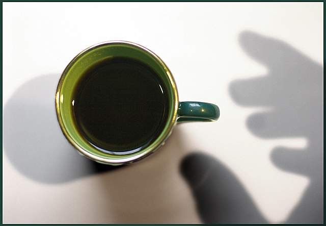
The first thing that I see when I look at this is the nice green cup. Wonderful color here. The shadow is very nice and creative. I like the effect on the thumb, looks more real than just a shadow. Overall, your composition is good. The only thing that really takes away from this picture is the shadow toward the bottom from the cup. This second shadow is very distracting. The color is also different from the other cup shadow and your hand. That I believe is the key to my distraction with this. Another commenter mentioned using a single light source, that may be the answer here. Other than that, I don't see anything wrong with this picture. The focus and contrast seem dead on IMO. The added black frame really helps to contain the images and strengthen the picture overall. |







 Add photograph to your favorites
 Add photographer to your favorites

 Photographer found comment helpful.


