I think a little more contrast might help the subject stand out a little more. Interesting composition, but the image seems flat. I can see what you're going for with the background, but I think it's a little busy.
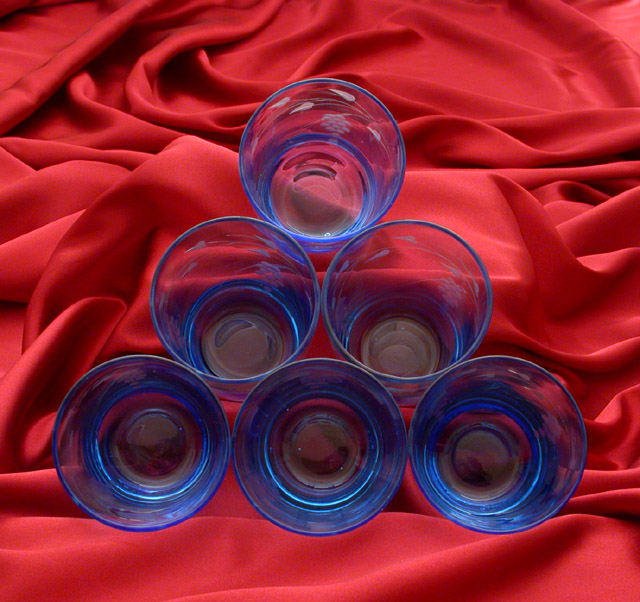
Good effort, but the color's a bit muted. I'm assuming you were trying to keep reflections out of the glass. The angle feels a little odd - it leaves a lot of background at the top that keeps drawing my attention away from the glasses. A good idea that you might have been able to improve a little with some more work.
Super lighting, nice billowing in the backdrop...just have a problem with the color, red might not have been the best choice.....hmmmm....yellow might have work for me.
Interesting, but I feel the background really detracts. A smooth red background would have highlited the subjects more. I do like the interaction between the glasses on the bottom and the fabric tho.





 Add photograph to your favorites
 Add photographer to your favorites


 Photographer found comment helpful.


