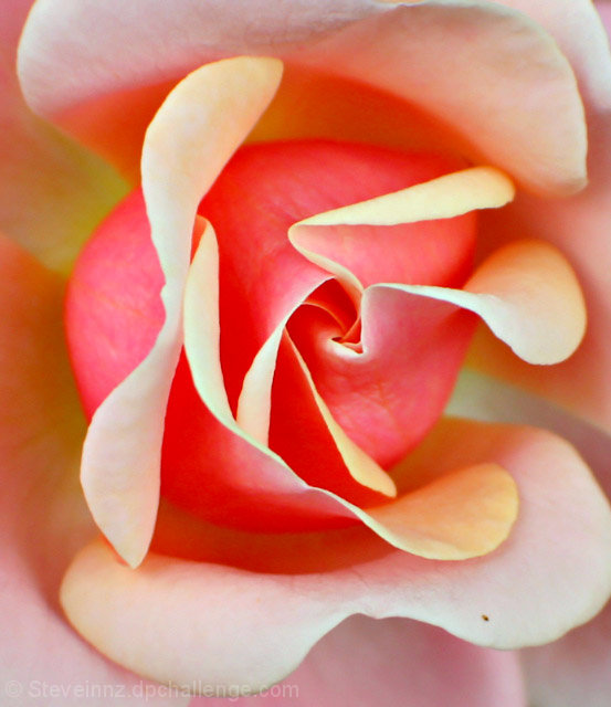
Good idea to fill the frame. Though, I would have chosen a lower angle to avoid centeration of the rose and get a more interesting viewpoint. I am not sure about the focusing and also seems overexposed - you loose colour on a few petals. Try to get as sharp results as possible, later you can post-process it to have a milder look. Using more diffused lights would result in better exposure than a harsh lighting.
Luminous while still being intracate. I like the abstract quality of the shapes the petals make, while still eing very aware of the conceteness of the rose. There is almost a movement to the shape - a pinwheel turning, unfurling - which is a fine way to portray romance. Very lovely.
The strongly vertical composition doesn't really work, here; I saw the picture on my 800X600 monitor (top and bottom hidden), and it looked mich better than it did when I made the whole thing fit on the screen at once.






 Add photograph to your favorites
 Add photographer to your favorites

 Photographer found comment helpful.


