Author Thread Comments Made During the Challenge
Post actions
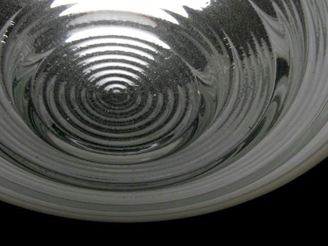
Good abstract of a light cover. Nicely done.
Post actions
I think maybe color would have worked here because in black and white, it almost looks like a reflection instead of a transparent something or other. With color, you may have been able to distinguish top/bottom, etc. I like the way it is framed, and the use of the empty space at the bottom. karmat
Post actions
I think color would have been better here.
Post actions
Post actions
This one works well in black and white... I love the concentric circles and the way the light terminates in the center... good shot ! = 8 - jmsetzler
Post actions
Very cool... I think a little more light is needed though, it's just a little bit too dark.
Post actions
Really clean and simple. Nice work.
Post actions
Nice patterns, classic b & w subject materiel (good contrasts), a bit on the dull side. Photo 8 Transparency 7 total 7 swash
Post actions
very nice. good use of b/w. great subject, very simple, yet deep.
Post actions
This needs at least some color.
Post actions
Very nice composition. Maybe it would have been nicer if it was completely black and white?
Post actions
cool shot - how come you didn't place it at the same angle as on dA? :)
Post actions
Interesting shot, good choice of BW, but something is wrong, lots of speckles around the white part, takes away from a very good composition.







 Add photograph to your favorites
 Add photographer to your favorites


