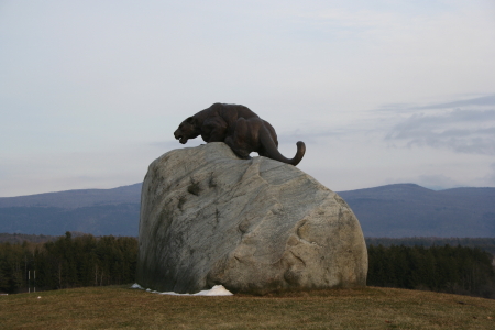
The composition feels very lacking, maybe if you had the rock and statue to the right side instead? Also, the colors look very bland and flat...adjusting curves and levels a little bit in Photoshop or something might bring out some better contrast.
This is a good picture, but I'm just afraid that this will be voted down because of the size, you should use the 640 pixels that we are allowed to use in challenges.






 Add photograph to your favorites
 Add photographer to your favorites

 Photographer found comment helpful.


