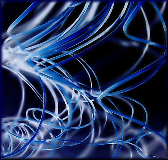
Color adjustment using something I never tried before, the mask layer "invert" using "difference" (I think it really does the same as a negative effect); crop; brightness/contrast; smudge brush to rid of small splinter distractions; rotated; neat imaged; buttonized border
This is actually those long straight sticks that spiral at the top. You can buy them at Walmart or Joann Fabrics in bunches. The shadow effects from them on the walls are great and the artistic appeal works well in any type decor really. I have two sets of them in large vases on either side of my entertainment center. I grabbed a bunch and held the curly parts back from the wall and used a flash to get the shadows behind it. By itself the photo looked blah. In PP I rotated it to be upside down, and using PP I was able to turn the background very dark using brightness/contrast; turn the image almost into a negative; and have the shadows look like wisps of white in neat image. I found it pretty attractive in the end.
Had no idea what to call it. :) At first I thought of "Under the Sea", as it kind of depicts what may happen under the water which we don't normally see. Then I called it "Spirals" which I thought was kind of boring. So I ended up with "Freedom". I think freedom of movement works pretty well for a title, although not sure some will get it.
Ironically it's blue. I just left it as it came out after some adjustments and didn't like it when I changed it to other colors, but it wasn't a blue challenge outtake.
Not sure how it will score, as I have said before, I am not a big abstract person, but just can't seem to really leave a challenge unentered so I gave this a shot. I have only entered one other abstract challenge before, and it faired pretty well. I figure those that live around great architectures or large sculptures, or who have DSLR's which can do some amazing things in camera as nrshapiro has showed us in the past, will certainly fair much better in this challenge though.
My best to you Neil and/or the top three!
Rose
Statistics
Place: 16 out of 325 Avg (all users): 6.5322 Avg (commenters): 7.3750 Avg (participants): 6.3514 Avg (non-participants): 6.8667 Views since voting: 2417 Views during voting: 252 Votes: 171 Comments: 12 Favorites: 0
Vaya manera de documentar tu trabajo. Me agrada mucho lo explícito de tus observaciones y pensamientos. Me gustó mucho la imagen y los comentarios la enriquecen.
very interesting. i like that it has kind of a smoky effect...i think it is b/c some of the stringy things are in focus and some are not...anyway whatever it is it came out awesome!





 Add photograph to your favorites
 Add photographer to your favorites


 Photographer found comment helpful.


