Not my first choice, but I had focus problems with the other for Off-centered. You may see it elsewhere centered.
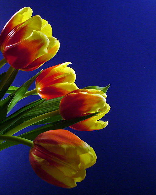
The tulips were in a vase in naturally, as tulips do, drooped in all directions. Shot the ones on the right side of the vase. Composition...eh...well almost.
Post: Open. Rotate. Layer adjustments for levels, brightness and contrast and hue/saturation. Healed some dust particles in the background as well as some lines in the poster board. Cloned out a very small portion of another tulip who decided to try to get in the shot on the upper left. Neat Image, a small dose, did not want lose too much detail. Healed some more dust and some hot pixels. Sharpen. Resize. Sharpen.
Oh...and the background was blue poster board. From Me? Can you imagine.
*************************************
Post: Well now you know why I usually use a black background! A lot less noise to deal with. I made a last minute decision to go with this and just did not have enough time to process the background separately with another dose of NI. Oh well.
Statistics
Place: 45 out of 357 Avg (all users): 6.1667 Avg (commenters): 7.4444 Avg (participants): 6.0000 Avg (non-participants): 6.4697 Views since voting: 1589 Views during voting: 252 Votes: 186 Comments: 11 Favorites: 2 (view)
RoB, you beat me by .001! I think the noise did hurt you a bit here. The black backgrounds, I feel, offer a more striking look. But, what do I know, I did worse than you in this challenge so I should keep quiet. :)
Fantastic color here. Like how you used complimentary colors. The focus is right on. Lighting is a bit harsh on the top flower but not overpowering, it just takes from the softness. Excellent.
I really like the colors and the composition on this. However the blue in the background looks noisey. Not sure if that was intentional or not, however I think it takes away from the photo.







 Add photograph to your favorites
 Add photographer to your favorites

 Photographer found comment helpful.


