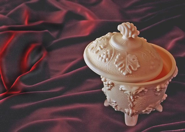
The camera, lights and the subject are borrowed. All post processing done with Photoshop CS.
Adjusted shadow/ highlight.
Cropped.
Minor dodging and burning.
Brightness/ Contrast adjusted
Unsharp mask on Subject. Neat image on Backgroound.
Resized.
Statistics
Place: 267 out of 357 Avg (all users): 5.0933 Avg (commenters): 7.0000 Avg (participants): 5.0076 Avg (non-participants): 5.2742 Views since voting: 772 Views during voting: 251 Votes: 193 Comments: 7 Favorites: 0
This is a nice study in lighting, but I think the subjects lacks interest (for me) and it looks a little too staged. You don't want to make it look like you tried hard, it has to be look efortless. (something I have yet to really achieve myself I'll admit) If the light is to be obvious, then it should be an intrinsic part of the composition. The red spot distracts from the subject IMO, and looks like an afterthought. The right side of the jar (or whatever it is) needs a little more bounce or fill light also. Possibly having the white light on one side, and a diffuse soft red on the other maybe. Having the red on the other side negates the negative space leading you to the subject. Also I think makeing the silky BG into a specifc pattern that gently leads the viewer by the hand over to your subject would be nicer than the haphazard arrangement. Good elements here, but I think you need to practice the arrangment and setup some more.
I love the clarity in the milk glass. The background is interesting.. I can't quite figure it out. It looks like red silk, but I can't quite figure out why it looks so muted when the glass is so sharp. :) I'm also curious about the grainy-ness of it.





 Add photograph to your favorites
 Add photographer to your favorites


 Photographer found comment helpful.


