| Author | Thread |
|
|
03/23/2007 09:07:03 AM |
Well, I guess you have had her as a model before!
this is also a great portrait.... |
|
 Photographer found comment helpful. Photographer found comment helpful. |
|
|
02/15/2006 01:26:09 AM |
|
| Photographer found comment helpful. |
|
|
02/09/2006 09:53:57 PM |
From the Critique Club
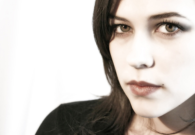
My inital thoughts were very stunning. I feel the image and subject fit very well with the challenge. The crop works very well for me. Enough of the head and hair cropped off and still some coming into the frame on the lower right. And the eyes nicely placed in the frame.
I feel the skin look wonderful at first but the more I look at it....it just seems a tad bit to desaturated. I mean it is very nice and any darker of a background and it would have been goth to me. Also it seems where the skin and the edge of the picture meet seems brighter. Probrably just an optical effect. I do not know what could have been changed if anything. I think the score is just the random scores and dislikes of the various members.
Great job. |
|
| Photographer found comment helpful. |
|
|
02/06/2006 11:37:54 PM |
|
this is stellar, I didn't even know you did it and I havn't said 'stellar' since 2001 |
|
| Photographer found comment helpful. |
|
|
02/06/2006 05:14:58 PM |
|
awesome post processing... man this rocks... and she is hot... whew! |
|
| Photographer found comment helpful. |
|
|
02/06/2006 12:08:50 PM |
|
very nice processing here |
|
| Photographer found comment helpful. |
Comments Made During the Challenge  |
|
|
02/05/2006 11:57:22 PM |
|
A lovely capture with impressive facial depiction of features. Very well presented. 7 Another bump. |
|
| Photographer found comment helpful. |
|
|
02/04/2006 09:08:07 PM |
|
| Photographer found comment helpful. |
|
|
02/04/2006 10:06:21 AM |
|
Nice light I like the high key effect. |
|
| Photographer found comment helpful. |
|
|
02/03/2006 11:19:26 PM |
|
wow, both eyes and the lips all in focus, I think that's a first on the portraits i've seen so far in the challenge. I never really like desat pics though... or is she really that pale I wonder..... nice mole(serious). maybe a bit too much negative white on the left, but I love the contrast stripes, pale face, dark dark hair and shirt, and white BG... just noticed the face is totally desat on the right. don't really like that you lose the ridgeline of the nose, lots of NI or NN(good?bad? i dunno).... still, 8 for those eyes. Would love to see this in color though. |
|
| Photographer found comment helpful. |
|
|
02/03/2006 08:23:48 PM |
|
Great comp, and beautiful use of makeup to accent the shadows of the eye. The foreshortening, lack of contrast in the midtones, and the bright highlight on the upper right side tend to flatten out the face, and make it look a little distorted. However, as a whole this image is absolutely beautiful. |
|
| Photographer found comment helpful. |
|
|
02/02/2006 04:17:25 AM |
|
lovely portrait and composition...the loose hair around her right side (on the neck) makes her neck look a bit messy...gorgeous eyes that you have captured really well...love the choise of white bacground...she has very similar colouring to my daughter (hair, eyes) love this 8 |
|
| Photographer found comment helpful. |
|
|
02/01/2006 07:58:30 AM |
|
Great portrait. Love how piercing her eyes are. 10. |
|
| Photographer found comment helpful. |
|
|
01/30/2006 05:44:17 PM |
|
Beautiful colour, well done. |
|
| Photographer found comment helpful. |
|
|
01/30/2006 04:54:58 PM |
|
The treatment is etrange imho...-7 |
|
| Photographer found comment helpful. |
|
|
01/30/2006 02:30:24 PM |
|
The model must love that shot! Wonderful photography. |
|
| Photographer found comment helpful. |
|
|
01/30/2006 02:11:36 PM |
|
excellent rendering. off center adds 8 |
|
| Photographer found comment helpful. |
|
|
01/30/2006 08:31:09 AM |
|
Really good. I like the de-saturated skin. It looks like porcelain. Beautiful clarity on the eyes and mouth. The mole is a perfect piece de resistance! Excellent. 9 |
|
| Photographer found comment helpful. |
|
|
01/30/2006 02:36:06 AM |
|
I think you could have cropped this at her shoulder and still had the subject off-center. The large white space just distracts the eye. |
|
| Photographer found comment helpful. |
|
|
01/30/2006 01:56:37 AM |
|
Beautiful girl and crystal clear eyes, can't help the feeling of overexposure making most of the face washed out, no texture in skin etc.. |
|
| Photographer found comment helpful. |
|
|
01/30/2006 12:24:22 AM |
|
awesome lighting. nice close up. 10 |
|
| Photographer found comment helpful. |
Theme:
Classic /
Light /
Dark
Home -
Challenges -
Community -
League -
Photos -
Cameras -
Lenses -
Learn -
Help -
Terms of Use -
Privacy -
Top ^
DPChallenge, and website content and design, Copyright © 2001-2026 Challenging Technologies, LLC.
All digital photo copyrights belong to the photographers and may not be used without permission.
Current Server Time: 10/15/2026 04:41:53 PM EDT.






 Add photograph to your favorites
 Add photographer to your favorites


