This is a great picture, I'm just afraid that this will be voted down because of the size, you should use the 640 pixels that we are allowed to use in challenges.
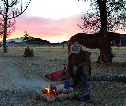
Good picture, but it needs to be bigger. It could use some light on the man's figure -- just enough to give it some more definition.
Technically, i guess this is off center, but it doesn't really give that impression. The fire is what draws our eye, and it is balanced by the coffee pot and the man's figure. The total impression, with the square format, is a centered picture.





 Add photograph to your favorites
 Add photographer to your favorites


 Photographer found comment helpful.


