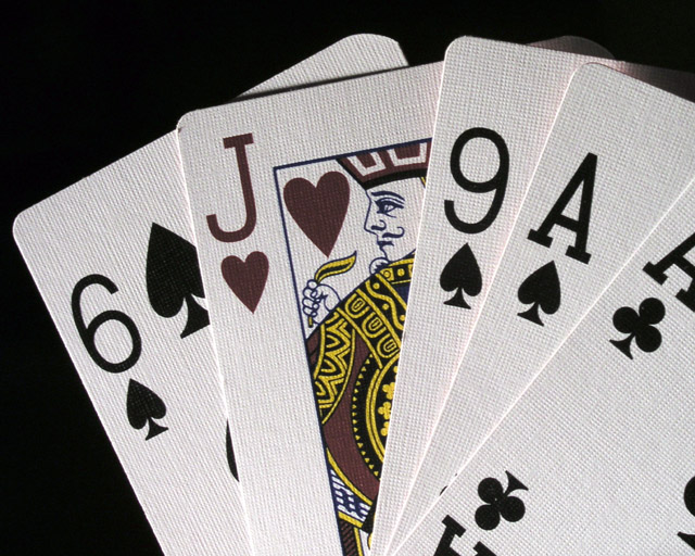
I tried to juice up the colors but there's some red reflecting off the backs of the cards which made it impossible without spot editing. (it may be possible but I don' know photoshop THAT well)
I put up a print that's a wider format (it can be cut down) and spot edited to really bring out the red
I do like the sharpness(that i can see the texture of the cards), composition and it meets the challenge topic. So technically I think is good. But it is very low in interest, there is nothing that makes me want to 'keep looking' at your photo. I think you have a lot of tecnical skill, maybe need a more interesting subject
Should have definately made the Jack level with the horizon. That would give it more "power" I think. And also use other cards beside the Aces. In my mind, the Aces compete with the Jack. Use 3's, 5's, 4's, etc. Good shot anway.
You might have juiced the saturation of the reds a little better to make the Jack stand out a little more, but it's a great crisp image, and a nice concept.
Looked at this for ages... thinking (s)he should have used a red card.. Then I see that a heart is a red card.. but it looks grey.. Is it black and white? No, the yellow is still there.. In short.. good idea.. think you should have made the card redder..7







 Add photograph to your favorites
 Add photographer to your favorites


 Photographer found comment helpful.


