Greetings from the Critique Club
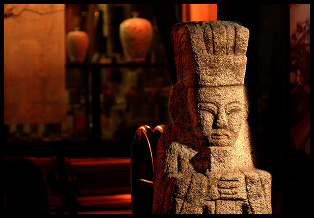
Very interesting picture. Good texture and lighting. The shadows seem to accentuate the texture well, good position. The one thing that really bothers me about this is the background. Other than the obvious brighter shine directly behind the statue, my eyes seem to go straight for that vase in the middle. I think with the light reflecting on the pillar directly behind the statue and then to the left onto the vase and continues to the shade, its very distracting from your subject. Its almost a leading line away from your subject. With advanced editing, I believe you can select all but the statue and darken it to that there is less competition. I like the similar color hues but it doesn't help with this background set up. I don't mean to sound so negative because I really like your subject. With a little bit more editing, I think it would really power up this picture. |






 Add photograph to your favorites
 Add photographer to your favorites
