Author Thread
Post actions
I think your title did you more damage then any element of the image. For future reference.
Post actions
how did you not pull off a brown with this? it's genius!
Post actions
Comments Made During the Challenge
Post actions
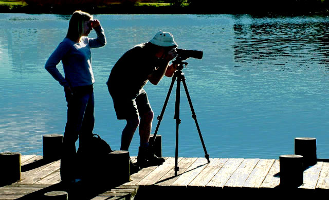
that would be "silhouette."
Post actions
well it sure is contrasty, thanks for pointing that out :-) great blue, but not quite a silhouette
Post actions
It may be meant to be as contrasty as this, but I don't like it.
Post actions
It would have worked better if it were a better silhouette. The white hat is a distraction.
Post actions
i find that if you have explain your picture in your title, you might be off to a tough start. would you not agree?
Post actions
Is the explanation really necessary ? Does it really matter if voters know it was meant to be like that ? I mean, your photo should be able to stand without support by an explanation.
Post actions
So its contrasty .. I got over that ... I like the off centredness.
Post actions
Post actions
Spell your title right. It's silhouette. The picture needs to be focused better.
Post actions





 Add photograph to your favorites
 Add photographer to your favorites

 Photographer found comment helpful.


