Greetings from the Critique Club
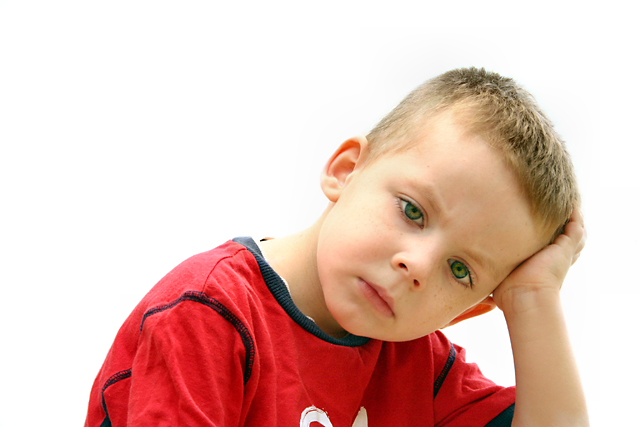
Very good composition here Kita. I think the comment concerning it looking centered is due to the fact that his upper body begins in the center, although his head is off center, it may have been tricky for some to see the difference. The lighting is pretty good, a bit too much on his neck and cheek. I like the color of his shirt and yes, even with wrinkles. That is what many busy boys end up in, It seems to really add to his expression. His arm serves as a nice line leading the viewers eye to his wonderful expression. You've really captured a beautiful expression here. Looks like he is really focusing on what he wants to do next and maybe a little frustration and boredom too. I don't see it being out of focus as one commenter mentioned, his face has a good softness about it that really brings out his character. Overall, I think you did a fine job at this profile picture. There is good use of space and rule of thirds. The positioning may not have worked well in this challenge but it is appealing and technically right on track.
|







 Add photograph to your favorites
 Add photographer to your favorites

 Photographer found comment helpful.


