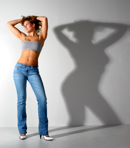
Great use of a cast shadow here. It would have been interesting to see the shadow cast more vertically with a more rectangular crop. Although, the dichotomy in the porportion here is very interesting. Great work and good luck.
The model's lighting is great, the shadow isn't. You can avoid that to a certain extent by moving moodel as far away from back wall as possible and then throwing a light at the shadow to kill it even more.
I love the shot, model is pretty and all, but the shadow looks obese and unflattering...was that an on purpose thing? If it was intentionional, then it's clever







 Add photograph to your favorites
 Add photographer to your favorites


 Photographer found comment helpful.


