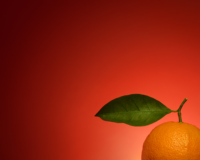
I decided to eschew originality for this shot, and woo the voters... I really liked the red/orange color scheme of gaurawa's goldfish, so I thought I'd try something along those lines myself. (Mostly I just wanted to use a red gradient background, because it looks so sexy.) This image also draws inspiration from arnit's "Caught Up."
My background is heavyweight art paper taped to foamcore to keep it flat, propped up on my desk, and lit from below with a $5 clamp-on lamp. (The bulb is one of those 60W equivalent fluorescent things.) Light on the orange was provided by my 420EX bounced off the ceiling.
The hardest part of making this image was keeping the exposure consistent on both the background and foreground, since I couldn't (in any effective, practical manner) change the intensity of my light sources. Also, it was pretty tough to get the radial gradient from the clamp-on light to have its focus in the right spot.
PP included using a radial gradient set to Multiply mode to help bring out the deeper red tones in the corners - the original exposure was a little bit too flat. Bit of selective color adjustments to make the leaf more green and the orange more orange, and some saturation boosts to brighten things overall. The use of Hue/Saturation was tricky, because too much resulted in color banding. A Gradient Map (masked to only affect the outer areas of the gradient) brought out the color in the dark parts. A high-radius USM also helped bring out the highlight detail on the fruit. Cloned out a few specks; resized; more USM; there we go.
Pretty pleased with how this came out... it was a good learning experience, and easier than I thought it might be (and a WHOLE lot easier than my Tribute entry was).
--
post: yay, my first top 10 and top 5, all in one! you can bet I'm quite pleased - it's an honor to have finished so well with so much strong competition!
Statistics
Place: 5 out of 357 Avg (all users): 6.7194 Avg (commenters): 7.8000 Avg (participants): 6.4921 Avg (non-participants): 7.1286 Views since voting: 3070 Views during voting: 312 Votes: 196 Comments: 26 Favorites: 17 (view)
Pretty shot Damon, simple and straightforward.Your work has been so rich and quirky lately that I would never have guessed this was yours. Sounds like you aimed at a top ten and hit the mark.Is this gonna be a new direction or more in the way of an experiment?
Thank you, Brennan, your words are flattering. I've thought about the fact that the stuff I've been producing has been kind of all over the map, but I don't really know what to make of it.
A new direction? I don't know, but I think that's a good question and I'm glad you asked. I do feel like I kind of turned a corner--or maybe turned a page, or shifted gears, or something--sometime during the past month, and suddenly I felt like I understood some things I had been struggling with before. It's weird, because at the same time as I feel like I'm doing pretty much the same thing I've been doing for a while now, I feel like things are working better.
This image was intended as an experiment in technique. If it bodes anything for what I'm likely to be doing in the future, I can't speak to that; I'm just kind of going with the flow. It's more like boating down a river or surfing a wave than flying a plane - I get the sense that I'm just along for the ride.
Or I could have been reading too much Vonnegut lately.
Pretty shot Damon, simple and straightforward.Your work has been so rich and quirky lately that I would never have guessed this was yours. Sounds like you aimed at a top ten and hit the mark.Is this gonna be a new direction or more in the way of an experiment?
Isn't amazing how easy it is to boost scores with simplicity? Congrats on 5th place. Sounds like you learned a bunch setting it up too. Only thing I didn't like about this was the pink. The red and orange are great by me but the pink just threw it over the edge. :P
Aha, a nice composition! I am not sure that I like the red colour in the background: orange already has a lot of red in it, so something more contrasty would work better for me.
Zesty indeed! I'm not usually a huge fan of this type of image, but this has zip and sas...and the light is great! You have managed to give a rather simple comp. amazing depth...well done.
Very nice. I like the backlit almost halo effect. The leaf really makes it as you don't usually see that on an orange. I like that you can really see the texture of the orange peel. The tomato red background is a nice contrast, yet complements the orange of the fruit. 8





 Add photograph to your favorites
 Add photographer to your favorites

 Photographer found comment helpful.


