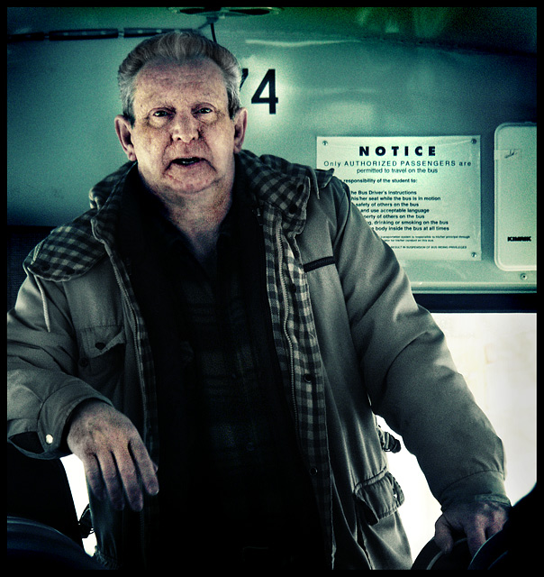
First Impression - the most important one: Nice, good focus, great portrait work.
Composition: Good composition, it doesn't rellay play too heavy of the notice you used for the title, and that may have confused the voters ... who are often confused :)
Subject: Defiantely meets off centred, both for the bloke and the signage.
Technical (Colour and light): I like the lighting here, would have liked to know what you actually used ... but probably daylight in the majority with a fill flash ... oh well :)
To grow its vote?: You have found an interesting character - again. It is nicely off centred, I don't know why it did not do better, the grittiness of the colours and the reality of the picture may have counted against it this time.
Summary: I like this shot, it is good for the portfolio, even if not the highest scoring. But this game ain't only about ribbons really.
If you've got any questions about this critique, please feel free to contact me via the PM system.
gave you a 7 - surprised this didn't score higher -
the composition reminded me some of DrAchoo's Tribute entry. I thought the use of image space was good





 Add photograph to your favorites
 Add photographer to your favorites

 Photographer found comment helpful.


