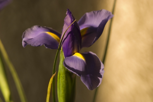
This image seems to be too centrally composed. I would suggest placing the subject in the thirds using ROTs. The two stems or leaves on the left could be taken out as they don't really add anything to the overall composition of the image.
He is certainly an out-there photographer and this is so untypical (but accurate) portrail of his work. I had trouble finding its focal point, but the overall effect is pretty good.
it strikes me that to really hit close to his style this image would need to be in a sepia or cyanotype (or douitone blue sepia), and B&W of corse. color just wasn't his prime focus. also composition wise he uses alot of leading lines with his flower shots the tem draws u in from the conor or an odd angle of view and the flower hits dead center, that kinda thing. u missed the mark here, IMHO.





 Add photograph to your favorites
 Add photographer to your favorites


 Photographer found comment helpful.


