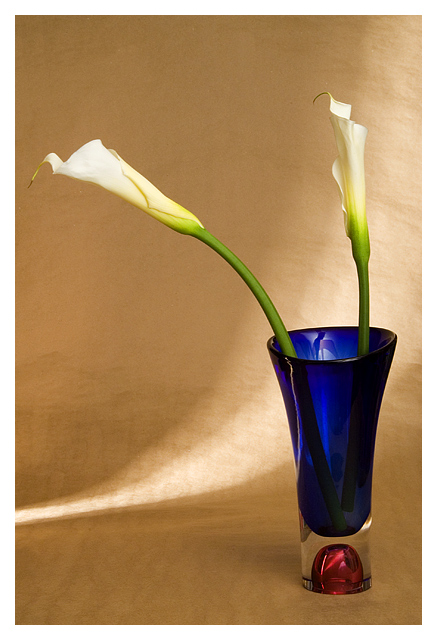
At the end of last year I bought a little "Mapplethorpe Flowers" calendar because I love his flower shots. I like the backgrounds he uses, the vases, the simple arrangements and his lighting. I was going to try and copy his style for 2006. So, when the challenge came along ... of course I knew exactly what I was going to do. Unfortunately, I left it all to the last minute, so there are some little things that I would like to be better technically, but I am very happy with the spirit of the image ... came out just as I imagined. It's been a while since I've imagined a shot, and then executed it. Things that I think are like his shots: the Calla Lily (there are several in the calendar, the vase, the lighting (there are two shots that hae streaks of light going across the background, and the packing paper background (again, there's one with that in the calendar).
Technical ... cloned out dust spots, as well as the corner of a cardboard box that peeked into the image, but I think that would've been cropped with my final crop anyway. Levels, curves. Tried Neatimage but I think that would've taken away too much detail, so I didn't do that. Cropped. And that's pretty much it.
I wish I had just a little bit more detail in the flower and a tad less exposure. I wish I could get my reflections under control. Other than that, I'm very happy with the shot, although that usually means it won't score well. I'm hoping for close to a 6.0, but think it'll be more like 5.5.
Updated an hour or so later ...
Thanks to my husband, who thought the vase overpowers the image (but I couldn't find another one that worked), I added a 2nd lily and turned the vase so it's not quite as dominant. I agree it makes for a better image.
Here's a link to the calendar that inspired me: //www.amazon.com/gp/product/3832711287/002-7263475-9589601?v=glance&n=283155
Statistics
Place: 44 out of 188 Avg (all users): 6.1836 Avg (commenters): 7.2000 Avg (participants): 5.7917 Avg (non-participants): 6.3370 Views since voting: 1440 Views during voting: 352 Votes: 256 Comments: 17 Favorites: 1 (view)
Beautiful lighiting. The repitition of curve in the stems, lilies, light, and vase really make for a wonderful composition. Excellent colors too. Perfect tribute to Mapplethorpe 10
I was almost certain Mapplethorpe does mostly BW. However, your interpretation of his work is superb. My suggestion is to probably have 3 lillies instead of two. Asymetrical compositions seem to work better in my opinion. The light source and patterns caused by your lighting is nice and soft and gentle. Good job.
I'm being introduced to many new photographers on this challenge, Mapplethorpe is another that I'm not familiar with. I like your tribute photo, it's very clean, very simple and very elegant. I like the stroke of light accross the backdrop, is this a signature of Mapplethorpe, or your nice addition? Very nice!
Lovely. I really like the light and the color is beautiful. Very evokotative of Mapplethorpe. And you chose someone I've actually heard of which is a plus. :D







 Add photograph to your favorites
 Add photographer to your favorites


 Photographer found comment helpful.


