Challenge:Wildlife II (Advanced Editing IV*) Camera:Nikon Coolpix 8700 Location: Mobile, AL - Mobile Municipal Park Date: Jan 24, 2006 Aperture: f/4.1 ISO: 50 Shutter: 1/223 sec Galleries:Animals Date Uploaded: Jan 24, 2006
Can't compete directly in this competition with dSLRs with great glass, so I used a bit of the Advanced rules to my advantage, I hope. At least maybe I'll get some coolness votes ;-)
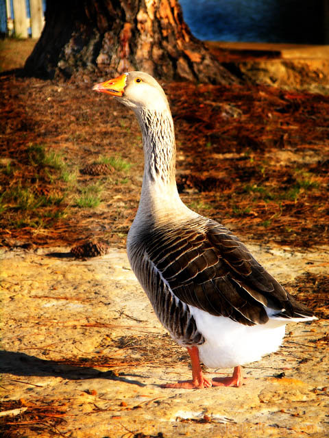
Mostly run a Gothic Glow action on the file with the Center of Intrest highlighted.
Did a little burning on the gooses feathers also.
USM ... resize... all that jazz.
Statistics
Place: 196 out of 261 Avg (all users): 4.9969 Avg (commenters): 4.8000 Avg (participants): 4.6481 Avg (non-participants): 5.1737 Views since voting: 915 Views during voting: 387 Votes: 321 Comments: 13 Favorites: 0
::: Critique Club ::: Greetings from the critique club! This guy looks ready to attack!
First Impression - the most important one:
Could be a cute shot, but the post processing is holding it back.
Composition:
The composition is good and follows the "rules," as the goose's eyes (my first focal point) are up in a corner. My eye then naturally follows the curve of his neck over his body and settles at the tail feathers and his feet. Good use of the photographic canvas. Distracting background elements are kept to a minimum by careful composition.
Subject:
Totally appropriate for the challenge. Even a DNMC stickler like myself can't argue that this bird ain't likely domesticated. He may eat food tossed by passers by, but he's not anyone's pet.
Technical (Color and light):
Here's where this photo starts to fall apart. I do like the 'texture' of his wings and back. There's an interesting pattern of feathers by his neck, but those are a little blown out due to USM or saturation boosting. His head is the real problem, and specifically his bill. The orange of his bill is really blown out and over saturated, and that's one of the first places I want to look.
The second problem is the hard edged burning that you did on the path around his body and the pine needles around his head. It looks like there's a light with barn doors under his chest, aimed at the tree. This is just unnatural, and it's obvious that you did it in PS. If the burning was really needed then I would have done it with a much softer edged brush, and much more discriminatively.
To get a Ribbon?:
Clean up the post processing and it would have gotten an above average score from me, as a voter. Perhaps to bump you into '7 land' a different composition (tight on the head/back) might have made it even more interesting? It's hard to say.
Summary:
It's a whimsical image. However, it's a rather average animal, in a rather average setting, so you got a rather average score. In flight, or with babies in tow, or something else to make it exotic and you've got a winner.
Finally, I'd like to ask you to consider "critiquing the critique." A lot of effort goes into these critiques, and I enjoy learning how I can do them better. Does what I said make sense? Is it way off base? Did I enlighten you? Offend you? Please let me know via a private message what you think of this critique, so I can give better ones in the future.
Not sure what you did with the colour here - the goose is well captured and the colour looks fine, but the orange tint to both the bg and fg looks so terribly artificial.





 Add photograph to your favorites
 Add photographer to your favorites


 Photographer found comment helpful.


