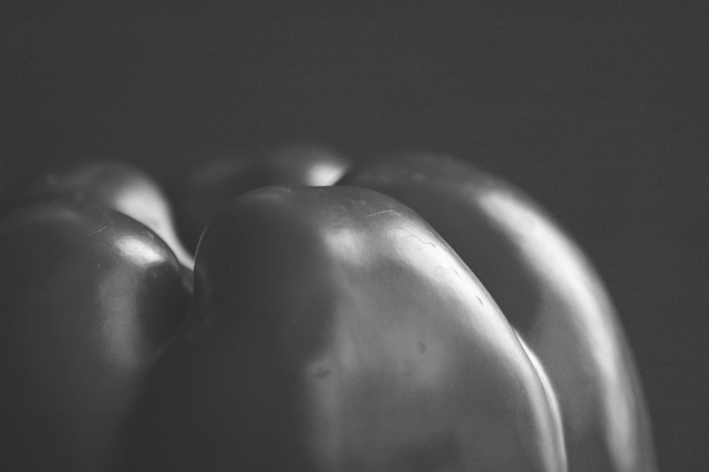
I love weston's images and I am an avid fan of his work. From knowing his work and seeing your interpretation of it, may I suggest that the distinction between true blacks and whites be made so as to make this image pop. As it is, the contrast seems too low. I like your take on his "Pepper" image though which is quite different from his versions. I think this is the intent of this exercise - that is to emulate someone but still leave a little of your own interpretation. Great try ;) 5
This is quite nice! Weston's pepper shots are among my favorites. There is a great point of view here, and the lighting is okay, too. It seems a bit hazy, though. Try using Unsharp Mask at a very high pixel radius but low percentage to get rid of the haze. Good work.






 Add photograph to your favorites
 Add photographer to your favorites


 Photographer found comment helpful.


