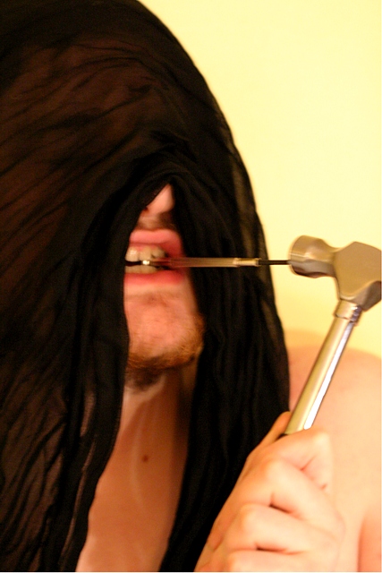
Thank you for all the comments on this. I am aware that the focus was a little off but entering has been a good learning curve, as the comments have pointed out some errors that I noticed. I think I shall attempt to re-do this at some point but improve the lighting, focus, change the background and put it in black and white.
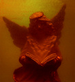
Is it just me or this image is blurry? I think had the background been black and with one light source, i think this would have been powerful. Peter Witkin is also know for burning the edges of his image. Maybe that's worth a shot as well ;)
in this case it is all about the light, his origional image is so contrasty and fanciful in its crometone state it really grabs the viewer. with your image which is both blurry and poorly lit/composed. u do not see enough of the figure, u do not have a story book sence of lighting and contrast, and the image is in color, not a hug thing, but definatly missing all the points of what makes his image so attractive and intriguing. also u have a white boarder on only 2 sides of the image the right & the bottom. not exactly taboo.






 Add photograph to your favorites
 Add photographer to your favorites


 Photographer found comment helpful.


