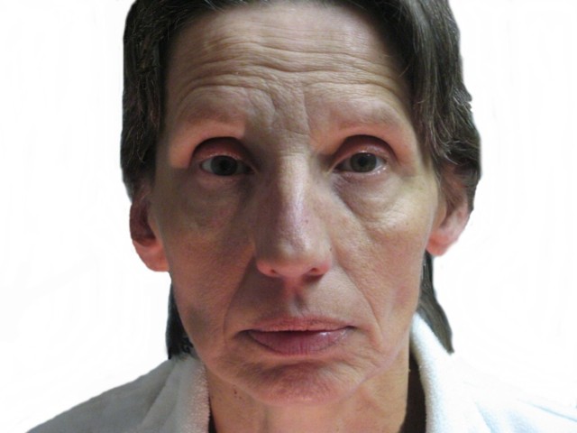
Followed Schoeller's exact method of capturing emotion. If i got my way, i would have had the model i wanted, but i couldn't arrange it in time. Lighting sertainly didn't help the matter, but capturing the feeling was the difficult part.
Taken in my basement, horrable lighting and alot of frustraition. Looks much better without the resizing! can't belive how much detail was lost. I'm really debating whether or not to take it out before the challenge starts or not... so if you read this in the aftermath... Know that the full version looks WORLDS better!@
I messed around with brightness and contrast, came to the conclusion that darker was better (less loss in detail) and the right shoulder was just noticable.
I'm still not happy =( lol
Statistics
Place: 170 out of 188 Avg (all users): 4.7222 Avg (commenters): 5.5000 Avg (participants): 4.5429 Avg (non-participants): 4.7988 Views since voting: 1550 Views during voting: 309 Votes: 234 Comments: 10 Favorites: 1 (view)
I googled mr schoeller, and i must say you did succeed to capture the emotion/expression like he does! nice !
The problem with the pic tho imo is that it lacks sharpness (due to resizing?) , lightning ain't that good, and the photoshopping is quite obvious around the hair etc...
A little better photoshopping could've bumped up the score i think.
While the close up photo works, I think an important thing missing here are the super lit, very sharp over exaggerated eyes that come across in his portraits. But I can see the inspiration.
Schoeller's portraits are tightly cropped even though expressions are stark and empty. I think for this image to be as powerful, first, sharp focus needs to be present. It's lacking in that area. A tighter crop would be good as well. Lastly, Schoeller's eyes are very sharp. I think this needs it as well. Great try though/
Composition is similar to Schoeller's although not portrait which is more common. Plain face with lots of character works well and in style. Missing catch lights I see in the eyes of Schoeller's work. Focus and sharpness is a little off. All this sounds negative ... and I don't mean it to. It is among my top picks in spite of the critique.






 Add photograph to your favorites
 Add photographer to your favorites

 Photographer found comment helpful.


