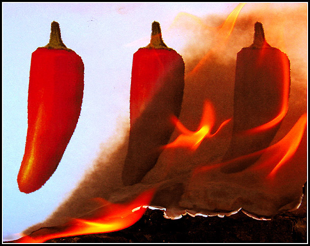
Many of you commented on the pixellation of the printed image.. This was in fact my test sequence and I printed them in draft.. The only problem was none of the other sequences burned so well without curling, falling off the peg.. you name it.. Valuable lesson for me though.. Thanks for all your comments..
I understand the concept of this pic, but the printed photo resolution is very bad. The fire isn't showing really well either. I like the idea, the execution just didn't turn out as well as it could have.
This is a great idea - but the image is a bit noisy. Perhaps it would have been better to make the final image smaller to reduce that. After all it would not detract from the concept or the effect. [7]
Cute idea. Clever and unique. Not sure about the whitish area of paper on the bottom. It's a bit distracting and looks out of place. I'm sure it's ash from the paper, just catches my eye.
I'm assuming this is a printout of the peppers that is being burned...? Would have been a bit stronger had the original image been a little sharper of the peppers, but this is a really cool idea and made me look twice.
Great idea... shame that your chillies weren't anti-aliased, the pixelated look really detracts here. The composition is a bit too centred for my taste... 3 symmetrical chillies and a diagonal across the centre make this crop a bit unimaginative for me. 6






 Add photograph to your favorites
 Add photographer to your favorites


 Photographer found comment helpful.


