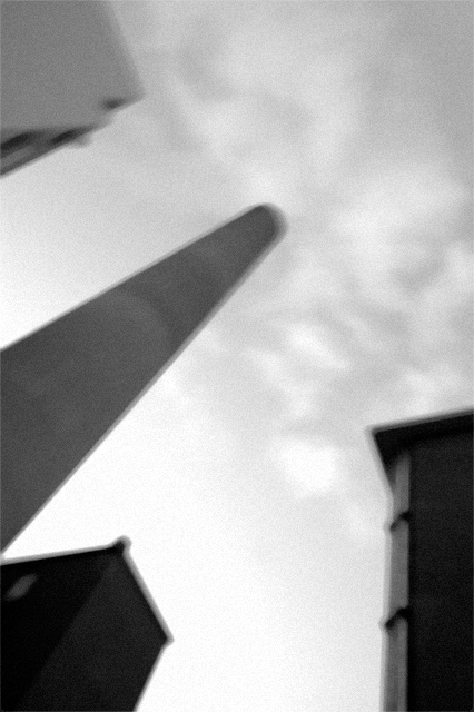
For the sake of anyone opening this image, I must say that I've since learned that Igor Posner's photographs are, probably, inspired by Michael Ackerman.
I can see what you were trying to do here. But as for your critism of "voters" what do you expect? The whole process of voting for images is a ridiculous one in the first place and often one person's vision may be complex and require time and a certain amount of education to appreciate as opposed to a snap judgement and a click of 4 on the mouse. The vast majority of people on here are here for fun (and posting pictures of flowers)!
I havent been part of this of long and I almost began to get frustrated with the lack of originality and expression but hell its a photography competetion!
Is the most popular the best or the easiest to understand?
You could argue the most popular was the most ordinary as in the popular music world where the trite and anodyne rule.
Anyway, looking through your pictures you have a unique vision and far from the middle of the road! And thanks for making me aware of the photography of Igor Posner.
regards
bood
As to whether I nailed it or not, that's very personall. Not all of Igor's images move me, but some of them move me greately. I hope that this image works for some people, and some of the comments under it indicate that that's the case.
You're right. It always boils down to personal opinion. Your image doesn't really move me, but I'm very glad to have found Igor's photos. There is some really inspirational stuff in there. And I guess that's what tribute photos are for - to highlight and acknowledge someone else's work.
So thank you for that. You might see some "Igor tribute" photos from me in the near future too... :-)
Yes, he shoots a lot of stuff grainy and blurry, but all of those images have a lot of energy in them. Sometimes the energy is disturbing/depressing, sometimes it is exciting. Your shot lacks any of that vitality - it just doesn't seem to make an emotional connection with me. I'm presuming a lot of the voters felt the same way.
Thanks for your comment. I would be very happy if a lot of voters felt the way you did; what bothered me is that, evidently, a lot of voters didn't bother to look at his website at all.
I am in agreement with your technical remarks.
If you are interested, the attributed photographer shoots on medium format film with a Holga camera (which explains the tonal range, natural vignetting, pleasant film grain etc). I have since found his other web site, which has the whole series in a more convinient to view presentation. Right now the site seems unreachable, but, hopefully, that's a temporary problem. //www.lightstalkers.org/igorposner
As to whether I nailed it or not, that's very personall. Not all of Igor's images move me, but some of them move me greately. I hope that this image works for some people, and some of the comments under it indicate that that's the case.
Yeah, I've checked out his website, and in my opinion, you just didn't nail it.
Yes, he shoots a lot of stuff grainy and blurry, but all of those images have a lot of energy in them. Sometimes the energy is disturbing/depressing, sometimes it is exciting. Your shot lacks any of that vitality - it just doesn't seem to make an emotional connection with me. I'm presuming a lot of the voters felt the same way.
He also shoots some stuff in focus.
And that's an interesting point - the blurry, grainy focus is used for effect. He doesn't just choose it for stylistic reasons. The style enhances the image.
Perhaps you could have chosen a subject that would have been served better by this effect.
The final thing I noticed was that he has an incredible command of tonal range in his photos - from bright highlights to deep shadows. That is something your photo could use a bit more of. The overall tonal range is just a bit flat, perhaps because there is so much sky in the composition. More emphatic contrast would really have gotten this photo to stand out more.
"Untitled" is an excellent tribute shot. I think including the website was an excellent idea, I don't know how many people actually checked it but they should have.
As for the photo, you defiantly nailed it. I think this was a tough photo to take but you defiantly have the style down. Unfortunately I think voters vote the shots they like and feel comfortable with. I think based on tribute and actual work you should have been in the top twenty. I would be very proud of this piece.
Thanks for the reply. I never thought of using a photography as a mirror, that is, to see the photographer, instead of the photographed. Thanks for that insight. But, I use that technique for voters, that is, by voting I don't only judge the photographer and the photography, but primarily myself. Just for the record, I didn't vote on this challenge, because it was really tiring: so many wonderful and extremely well done shots. And, your photo was one of the most difficult ones to vote.
As for the pattern in the photo, I saw it and I liked it, but I don't really know if the blur helped it. Now I know that the patterns are not the focus of the photo, but photographer's mind.
I understand the blur applied to people: I guess it's meant to mean that those people are faceless, or dynamic, or forgotten, or whatever, but always with a sad and depressing feeling. But, I don't understand the blur in structures, buildings, and shots that aren't abstract enough to be abstract. I'd appreciate if someone would explain to me what is blur doing to this photo?
Buildings also have faces. Blur does not necessarily mean that a person is faceless, it may mean that the details are not important. As you mentioned, blur can add mood to a photograph. In case of the photographer to whom this is a tribute, a photograph speaks about the photographer's feelings, not those of the subjects. There is a lot of stress, depression, and monotonousness to living in the city (to the extent whan one can't imagine living without them), so, in my understanding, pictures like this depict those conditions, the messiness of one's state of mind, when you look up to see the sky, and you see buildings and pipes, and you like it!
It took me a while to compose this shot. See how each building fills a corner and is either parallel to one edge or forms a diagonal with the pipe?
Originally posted by gjumi:
To the author: I hope you take pictures for your and our enjoynment, but not for the vote of the anonymous Mr. Joe from DPC.
Definitely. It just angered me when people dismissed this picture for being blurry and grainy without even having a look at the provided link. This was a Tribute challenge, after all! To me, though, those few who liked, or at least tried to understand this shot, were enough reason to post the picture here.
I understand the blur applied to people: I guess it's meant to mean that those people are faceless, or dynamic, or forgotten, or whatever, but always with a sad and depressing feeling. But, I don't understand the blur in structures, buildings, and shots that aren't abstract enough to be abstract. I'd appreciate if someone would explain to me what is blur doing to this photo?
To the author: I hope you take pictures for your and our enjoynment, but not for the vote of the anonymous Mr. Joe from DPC.
To all those who approached this image with an open mind, and checked the attributed photographer: I thank you. I was glad to see that several people commented positively even though they don't like this style of photography; that's what a tribute challege about!
Thanks for providing the link, I enjoyed browsing the site. You have captured a similar feel although I would have been tempted to put a really interesting border on my submission like many of the more challenging shots on the site.






 Add photograph to your favorites
 Add photographer to your favorites


 Photographer found comment helpful.


