Your photographers comments do not give me much of an idea of what you were trying to accomplish, so let's see what we can come up with...
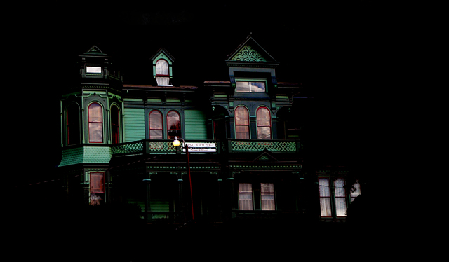
You have some very nice tones in this shot. Unfortunately because of how dark the shot is you don't have much OF the tones to give the shot a lot of feeling.
My eye keeps trying to find a place to rest. An actual subject of the photo. The house itself doesn't have enough ooommpf to hold the attention all by itself so my eye keeps wandering. It tries to land on the sign in the center of the shot. I can't read what the sign says though due to the sizing constraints of the medium that is DPC.
That is part of the problem with this shot. At 8x10 this may look very nice. At 640xSomething it just doesn't have enough attention grabbing power. This is something to keep in mind when entering challenges at this site.
I think you have a good eye and I think that this probably is much more interesting at a decent print size but in the challenge situation that you placed it in, it didn't have a chance...
This challenge is ongoing, bcoble, or pcoble, I forget the exact username now. It is my strong opinion you should not have put this image in your portfolio to be seen until challenge end. Due to revealing your anonymity, I am going to lower you by two points on my score.
I can see no fantasy. You should maybe have rotated the house a bit and cut out the right most window. Something is in its way.
This picture has a clear focus but nothing else.
I think many would relate to this fantasy......... driving (walking) past a well lit expensive home and dreaming about the people who live in a home like this and might I ever live in a home like this...... it's almost like an anti-silhouette - I like the way you show color in this overall black photo.
seems a bit slanted and a bit too dark (is that daylight reflection the upper window?). And the lantern is redundant. On the other hand the tones and shapes of the visible part of the building are very pleasing.





 Add photograph to your favorites
 Add photographer to your favorites


 Photographer found comment helpful.


