(I'm writing this before I read the comments and score...)
These are thoughts as they occur to me.
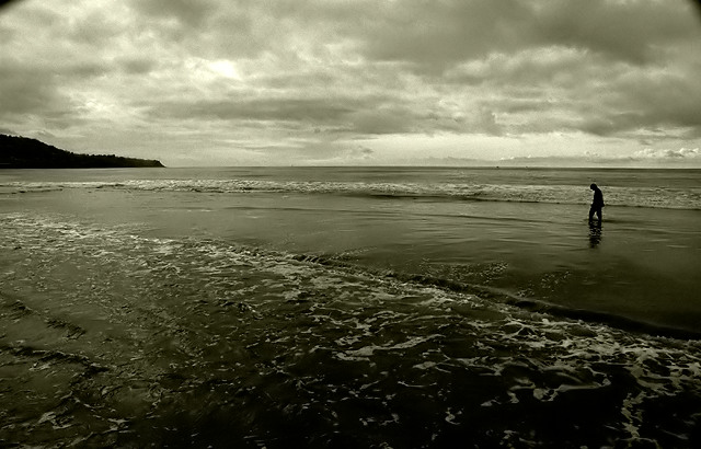
#1 Good strong lines. Is this wise given the theme of fantasy?
#2 The overall darkness does not lend itself to a fantastic approach unless you wish to appear devilish.
#3 The vinegetting is unfortunate.
#4 More toning would fit the DPC style better: blacker darks and brighter whites.
#5 Great lines (did I already say that?). The lines are strong, but the meaning of the title is that dreams go wrong. Do these two elements go together well?
I like this entry and would have voted it a 6. Why not higher? It's too dark for a fantasy image.
Don't you mean "Burgeoning" rather than "Bludgeoning"? Your title might make sense if the picture contained water violently smashing against rocks, but this looks rather calm and pensive.
The contrast is nice, and the color cast adds a nice feeling of atmosphere. If you'd have dodged & burned the sky and waves a little more this could have been even moodier. I'd prefer to see the horizon a little farther from the center of the frame. The land jutting into the left edge of the frame does a good job of grounding the shot and giving it a sense of scale. The harsh vignetting on the top corners are a little distracting; if the effect was more subtle I think that it would improve the the image.
Might try cropping more to eliminate the vignetting in the corners. Nicve idea, but you can tell that he is not walking ON water, but in shallow water.
Still nice photo, although the gray scale is a bit on the dreary side.
the picture delivers a certain feeling (loneliness, longing) very well, but the person's legs seem to be rather submerged. Also I'm not sure, whether the dark corners are intentional.







 Add photograph to your favorites
 Add photographer to your favorites

 Photographer found comment helpful.


