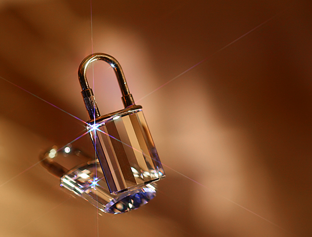
Inspired by Van Rossen (//www.vanrossen.com/index.html) who photographs jewellery in such lovely and interesting ways, rather than the clinically white background that so many use.
I tried to take a photo that shows off my pendant in a way that complements both the crystal and the gold.
To give you an idea of scale, the whole thing is 42mm (1.5") tall.
Post processing:
crop, clone out string and a few spots (thank God for the advanced editing for this one). Then I played with levels, curves, saturation, contrast and whatever else I could find LOL.
VERY low/little sharpening, then resize and ready for web.
In case you're interested in the set-up, here it is
Statistics
Place: 17 out of 188 Avg (all users): 6.6301 Avg (commenters): 7.8235 Avg (participants): 6.3733 Avg (non-participants): 6.7427 Views since voting: 3776 Views during voting: 395 Votes: 246 Comments: 23 Favorites: 2 (view)
Well, to be honest after checking out his website I think this photo might be better! He does great photography but nevertheless....move over Van Rossen! 10.






 Add photograph to your favorites
 Add photographer to your favorites

 Photographer found comment helpful.


