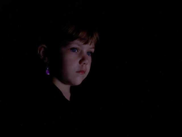
I was inspired by Bill Hensons Paris Opera project. I loved and tried to portay the subject as having the story rather than the "opera" which is what the occasion is that has brought these people together. Ia also like the use of contrast of light and dark to enhance the subject.
I also had to adjust the curves a little as my monitor at work made it look extremely dark, hopefully not too many voters will have this issue otherwise my score is really going to suffer.
Statistics
Place: 172 out of 188 Avg (all users): 4.7177 Avg (commenters): 5.6364 Avg (participants): 4.5333 Avg (non-participants): 4.7977 Views since voting: 2298 Views during voting: 335 Votes: 248 Comments: 12 Favorites: 0
First impressions: This image seems to have a somber feel to it. This is probably due to the child's expression (intended or not)
Composition: The child is placed well in the frame with plenty of space for her to look into. Good use of negative space.
Exposure: Though I think you were going for a 'fade to black' look I feel the image a little underexposed. The skintone doesn't seem right. Good catchlight in the eyes.
Impact: The impact is gained from the child's expression and use of negative space.
Had I voted on this challenge I probably would have given it a 6.
Nice use of single light source. However the image seems to lack a bit of contrast. In my bright monitor, it's already fairly dark and is evidenced in her face. Her look is stunning though and leads me to think what she was thinking about when you took this beautiful image. I'm sure this will be a keeper in your family for years to come.
From an article on the net: simultaneously intimate and distant. In his world of shadows and suggestion, writes Peter Craven, a face is more than just a face.




 Add photograph to your favorites
 Add photographer to your favorites


 Photographer found comment helpful.


