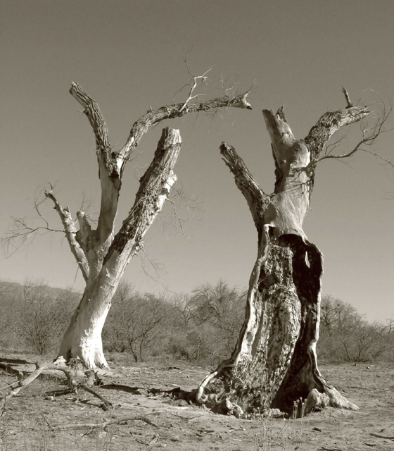
slightly cropped, Went back and forth on the sepia setting, exposure and saturation controls to come up with the way the photo looks. I ran it through Neat Image then played with the saturation again. I resized, and saved for web.
Statistics
Place: 98 out of 188 Avg (all users): 5.5882 Avg (commenters): 6.5000 Avg (participants): 5.4412 Avg (non-participants): 5.6471 Views since voting: 9082 Views during voting: 334 Votes: 238 Comments: 7 Favorites: 0
I wasn't familiar wit the photographer at first so I googled him and am impressed with your tribute. It is very fitting to some of his photo I saw.
technical side I think your biggest problem here was your highlights. They seem to be blown out in a few spots. other then that I think you did a good job in the duo tone usage here. Your shadows could be lightened a bit on the tree to the right as well.
A different day where there are clouds or something in the sky to add more, that is one of the few things lacking interest here.I think it would help define some of the branch's that seem to fade into the sky now.
[quote]he elevated many of his images into an iconic status that perfectly captured the melding of everyday existence in urban and rural Mexico...[/quote]
His works tend to focus on people and life. Not sure this captures that for me. I couldn't find any examples of his works that where landscape based.
How bare yet beautiful the old stumps look. Like an old married couple on the beach. I love the tone too. The scrub in the background adds a nice touch to the composition.






 Add photograph to your favorites
 Add photographer to your favorites

 Photographer found comment helpful.


